
abtest.design
A/B test results from apps like Duolingo, Headspace and Clarks, collected by Mobbin. 48 A/B tests from abtest.design. Each one as notes: what was tested, which version won, and what to take from it.
Ask all of them a question · The course
Paywall & free trial17
 Paywall & free trial test
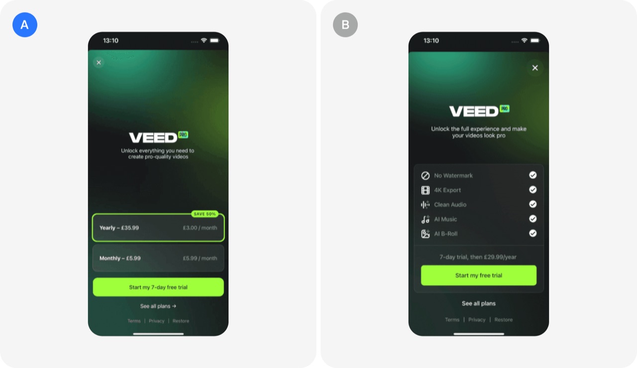
Showing pricing options upfront: VEED's A/B test
VEED tested a paywall that showed yearly and monthly prices upfront against one that sold the benefits of Pro. The pricing-first version won on trial conversion, paid conversion, MRR and ARPU.
- Show yearly and monthly plan prices upfront on the paywall
- Test a pricing-first paywall against a benefits-first paywall
- Track revenue metrics, not just trial conversion, when judging paywall tests
 Paywall & free trial test
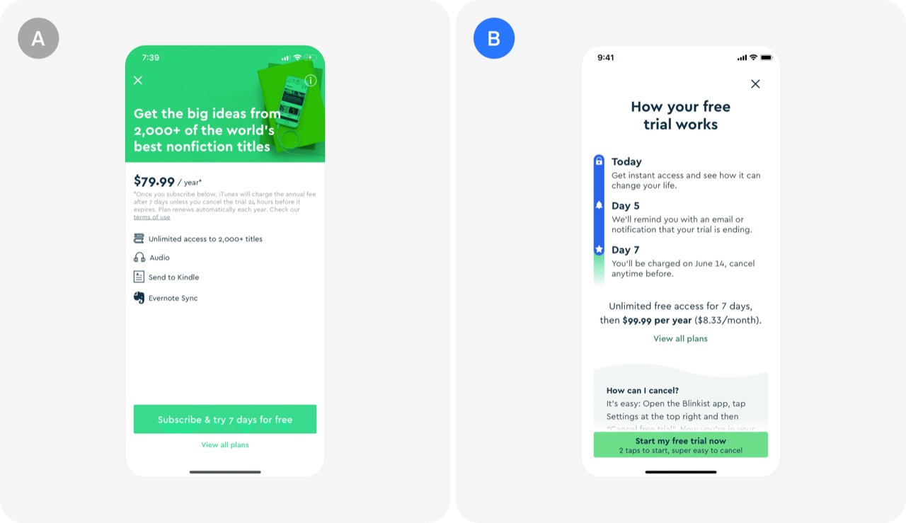
How your free trial works: Blinkist's A/B test
Blinkist rebuilt its free trial screen to show a clear step-by-step timeline of the 7-day trial, with a Day 5 reminder and a Day 7 charge notice. The change led to 23% more trial signups and 55% fewer customer complaints.
- Show a step-by-step timeline of how your free trial works
- Promise and send a trial reminder before the first charge
- Fix your biggest customer complaint to lift paywall conversion
 Paywall & free trial test
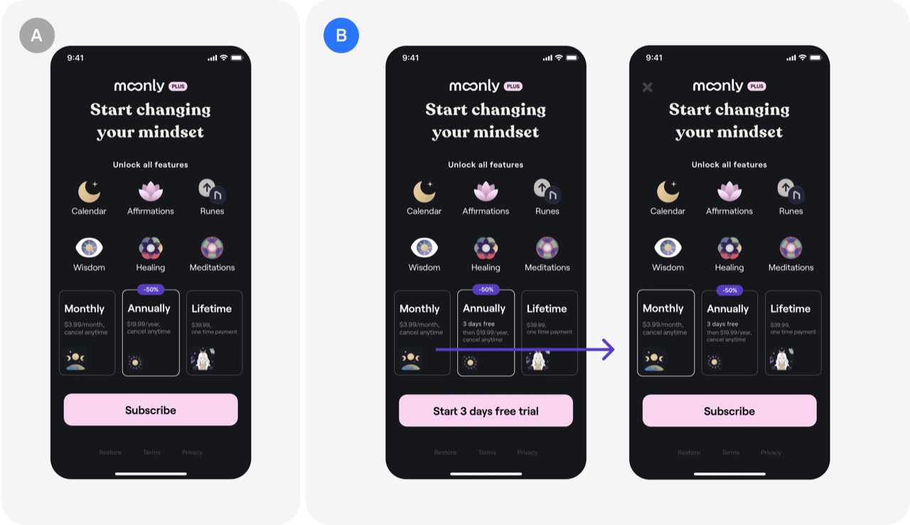
Free trial only for annual subscription: Moonly's A/B test
Moonly offered a free trial only on the annual plan, which pushed users toward the annual option because the trial made it feel safer. The test lifted view-to-subscription conversion by 39% and revenue per 100 installs by 47%.
- Offer the free trial only on the annual subscription plan
- Use a trial to steer users toward your highest-value plan
- Judge paywall tests on revenue per 100 installs, not only conversion
 Paywall & free trial test
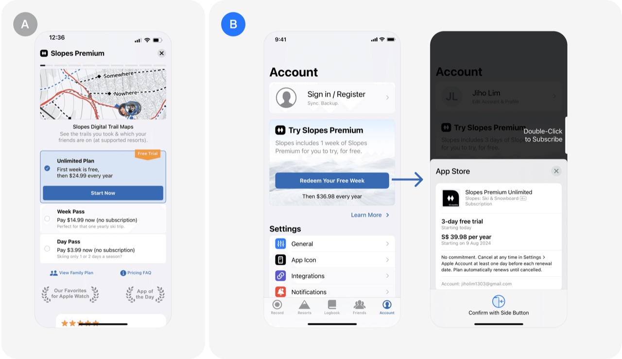
Payramp, not Paywall: Slopes's A/B test
Slopes replaced a secondary paywall screen with a one-touch "payramp" that starts a free trial right away. The change produced a 25% improvement in trial starts.
- Let users start a free trial with a single tap
- Word the trial button as something users gain, not give
- Replace paywall walls with ramps that ease users into the trial
 Paywall & free trial test
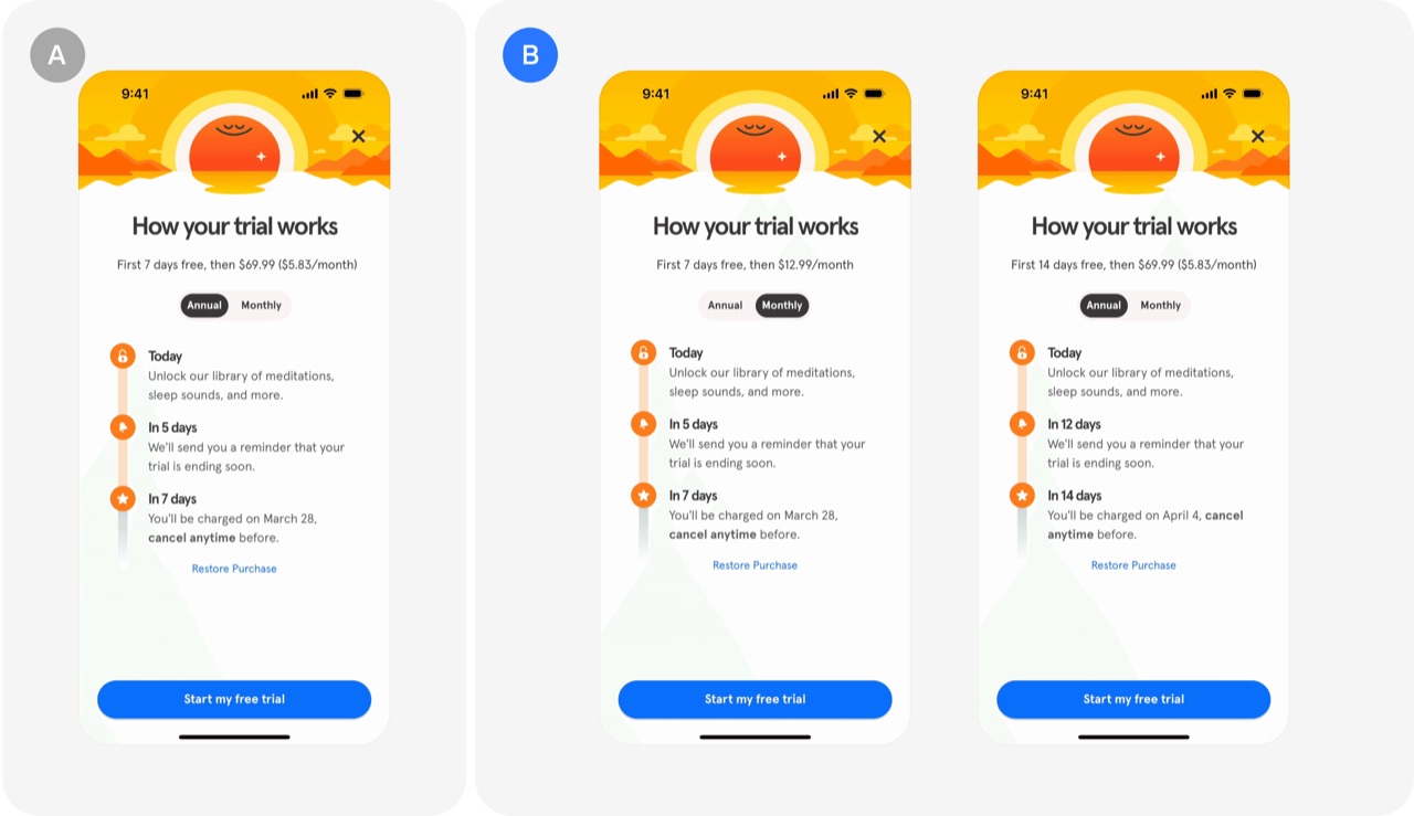
7-day trial for monthly & 14-day trial for annual subscription: Headspace's A/B test
Headspace tested free trial lengths of 7, 14 and 30 days and landed on tying trial length to the plan: 7 days for monthly, 14 days for annual. The change produced a double-digit increase in conversions even though revenue arrived later.
- Give annual plans a longer free trial than monthly plans
- Test several trial lengths, such as 7, 14 and 30 days
- Accept delayed revenue when a trial change lifts conversions
 Paywall & free trial test
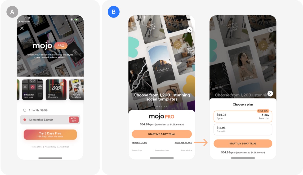
Yearly plan as the default: Mojo's A/B test
Showing only the yearly plan on the paywall, with monthly tucked behind a link, shifts more buyers onto annual subscriptions. Mojo's test raised the share of yearly subscriptions by 15-20%.
- Show only the yearly plan on the paywall by default
- Keep the monthly plan reachable through a View All Plans link
- A/B test your plan layout against the traditional two-plan paywall
 Paywall & free trial test
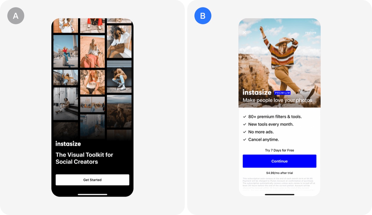
Optimizing paywall placement: Instasize's A/B test
Instasize tested showing its paywall at different points in the user journey to find the best moment to convert. Showing it right after the app opens won and lifted premium subscriptions by 7%.
- Test showing the paywall immediately after the app opens
 Paywall & free trial test
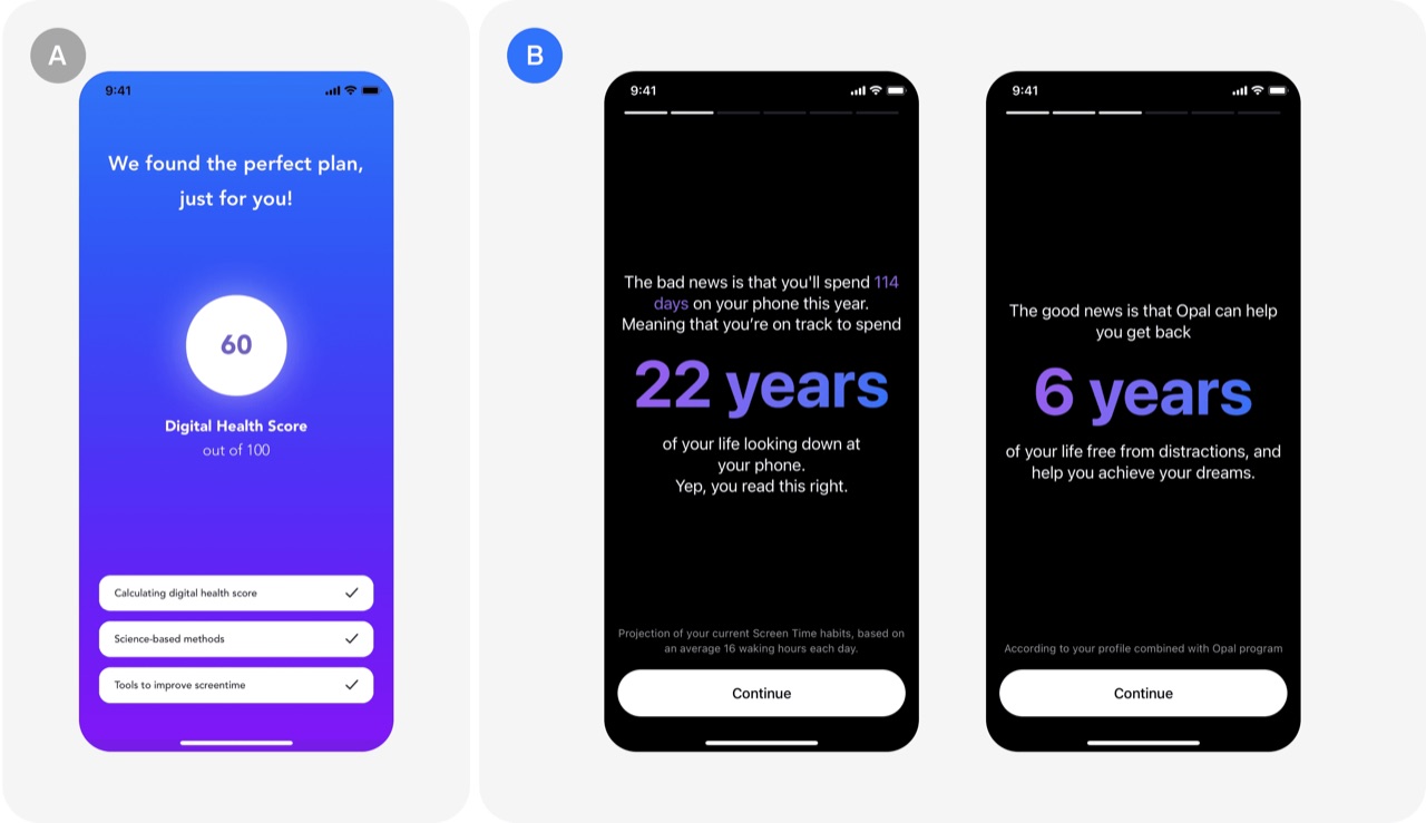
Driving motivation: Opal's A/B test
Opal projected how many years a user would spend on their phone over a lifetime and showed how many they could save, creating a moment of high motivation right before the free trial offer. Through several iterations, trial sign-ups from downloads rose from 7% to 17%.
- Show users their projected lifetime phone time before the trial offer
- Time the trial ask to a peak motivation moment
- Use motivating framing to attract users who will actually engage
 Paywall & free trial test
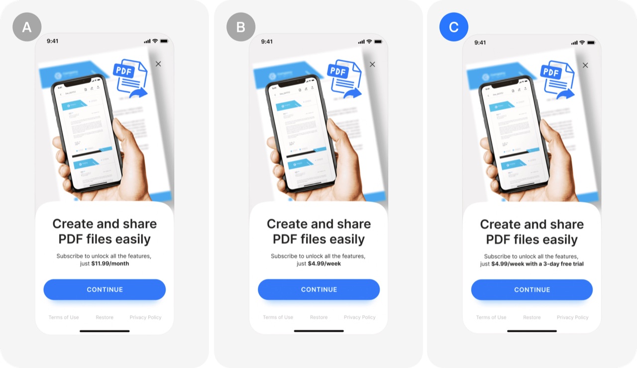
Monthly vs Weekly vs Free Trial: the pdf scanner's A/B test
A PDF scanner app tested three subscription models against each other: monthly, weekly, and weekly with a trial. The weekly plan with a trial converted almost twice as well as the monthly plan.
- Test a weekly plan with a free trial against monthly and plain weekly
- Compare trial, weekly and monthly conversion rates against your own paywall
- Pick the subscription model by profit, not by habit
 Paywall & free trial test
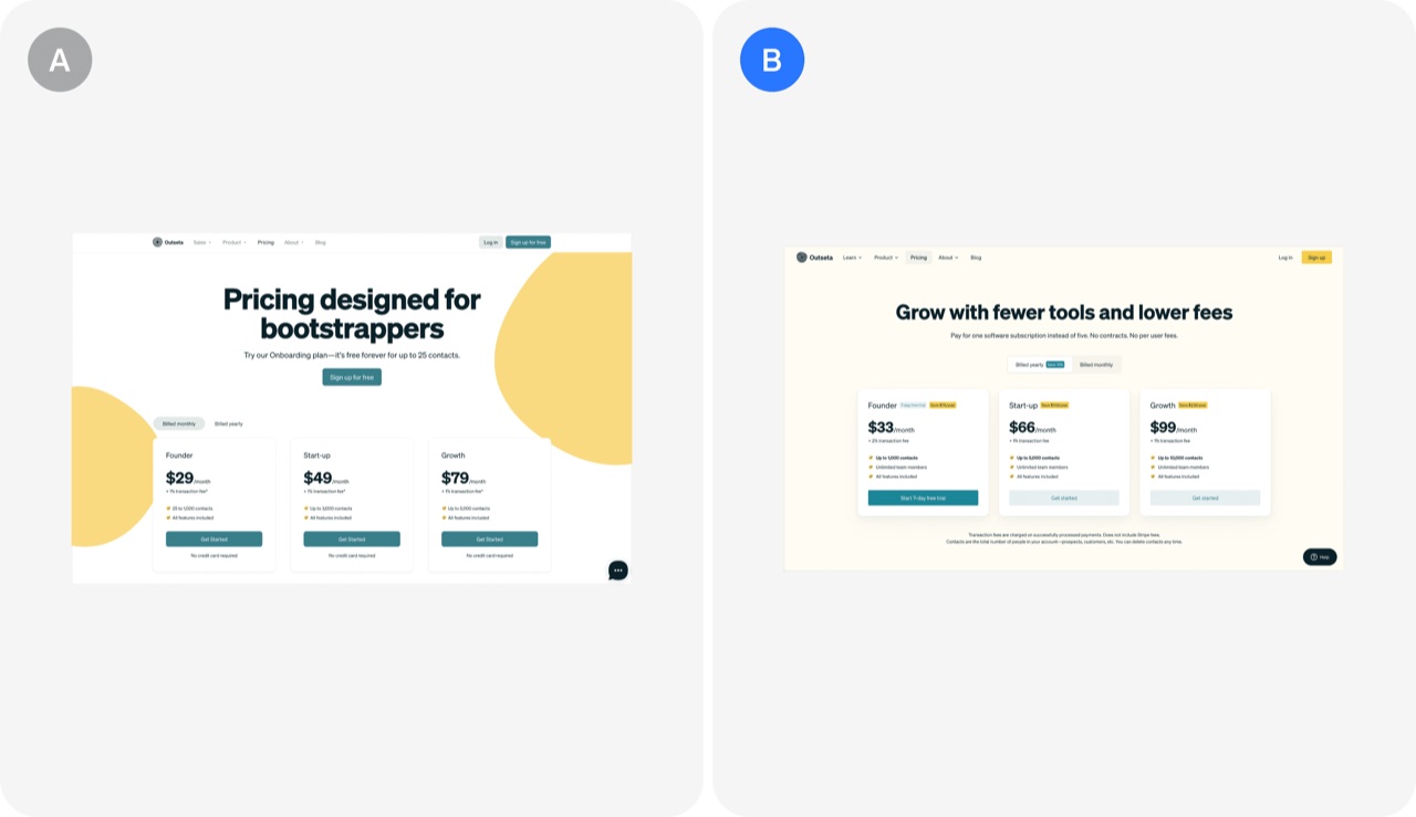
Credit card-required free trial: Outseta's A/B test
Outseta moved from freemium to a 7-day free trial that requires a credit card, filtering out less serious sign-ups and easing the load on support. The change lifted conversion from 7.25% to 35%, roughly 4 to 5 times higher.
- Replace freemium with a 7-day credit card-required free trial to lift conversion
- Require a credit card at sign-up to filter out low-intent users
- Cut support load by ending free plans for non-paying users
 Paywall & free trial test
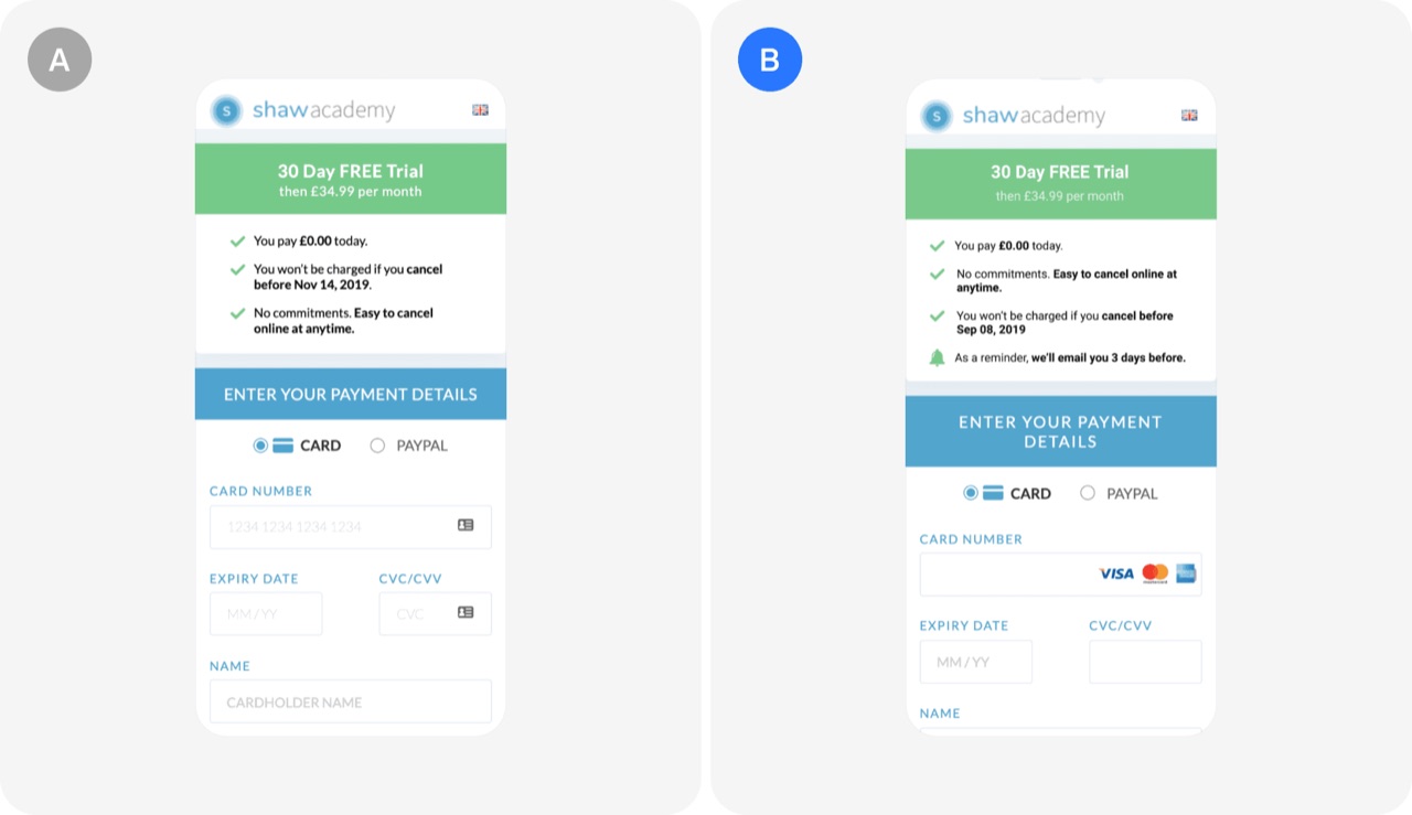
Free trial reminder: Shaw Academy's A/B test
Promising a reminder email 3 days before a free trial ends can raise trial sign-ups without a meaningful rise in cancellations. Shaw Academy's test of this idea produced a 14% increase in sales at over 99% significance.
- Promise an email reminder 3 days before the free trial ends
- Run bold trial experiments but track cancellations as a guardrail metric
 Paywall & free trial test
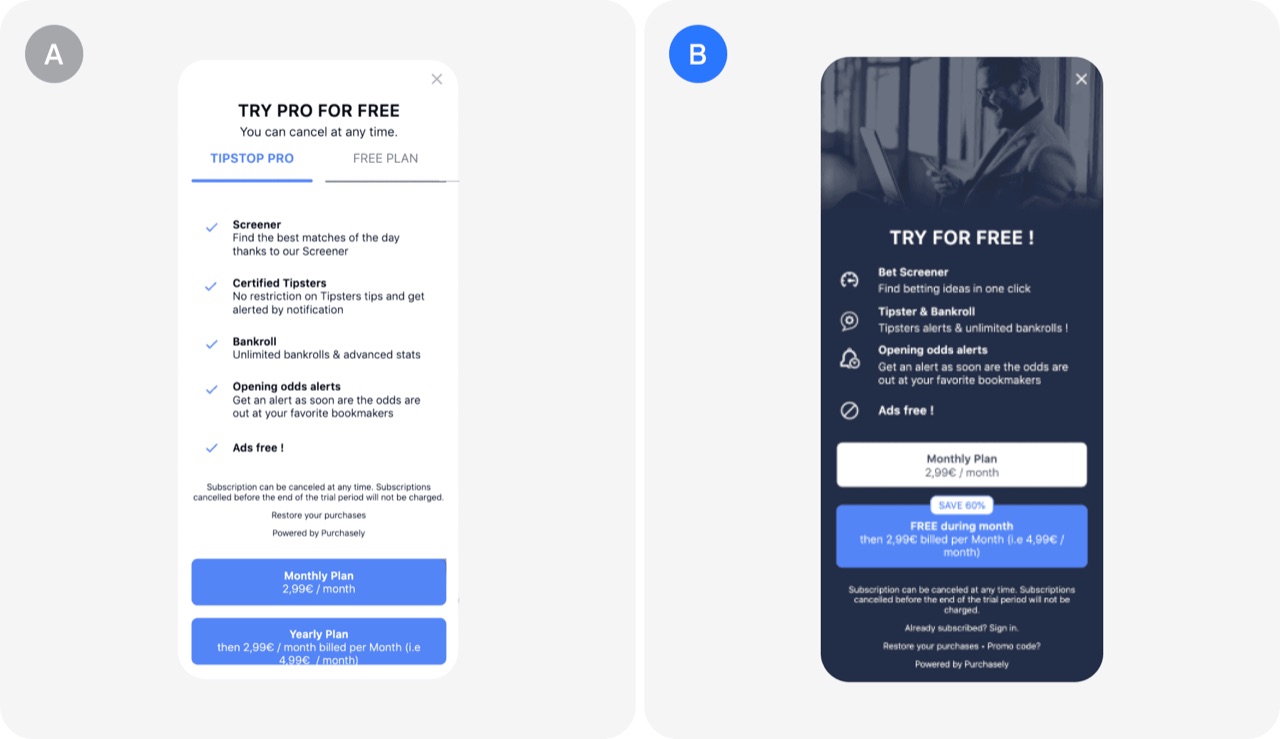
Clear free trial message + discount badge: TIPSTOP's A/B test
A paywall test showed that stating the free trial plainly and adding a prominent discount badge can lift sign-ups, with both variants listing the same premium features. The version with a 'Free during the month' message and a 'Save 60%' badge produced a 190% jump in direct conversion.
- Add a plain free trial message to your paywall
- Show a prominent discount badge like 'Save 60%' on the paywall
- Keep the feature list identical and test the offer messaging
 Paywall & free trial test
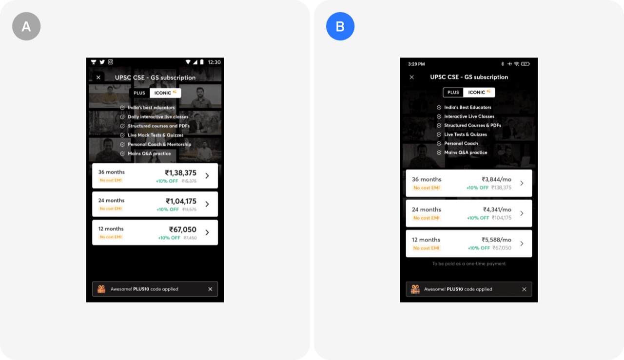
Highlighting monthly pricing: Unacademy's A/B test
Unacademy changed its pricing page to lead with the per month price instead of the full course price. The change lifted click-through rate by 13.5% with 100% significance.
- Show the per month price instead of the full course price
- Test price framing before changing the actual price
- Judge a pricing page test on click-through rate with a significance check
 Paywall & free trial test
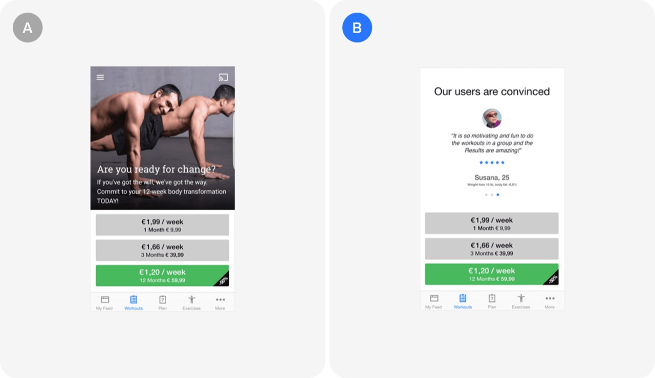
User reviews on paywall: Runtastic's A/B test
Runtastic replaced the promotional statement on its paywall with a real user review and a 5-star rating to use social proof. The change produced a 44% increase in paid subscriptions.
- Replace paywall promo copy with a real user review and 5 stars
- Test social proof against your own marketing claims on conversion screens
- Expect large upgrade gains from small paywall copy changes
 Paywall & free trial test
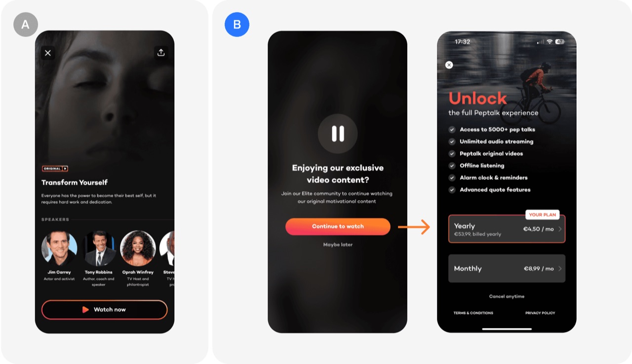
Hard vs soft paywall: Peptalk's A/B test
A paywall test on Peptalk compared an intermediate video details screen before the paywall against letting the premium video play for 10 seconds before the paywall appeared. The preview-first variant significantly beat the details-screen variant on conversion, though no exact numbers were shared.
- Let users preview premium content for 10 seconds before the paywall
- Do not add a details screen between premium tap and paywall
- Test paywall fixes at the specific trigger point with the biggest drop-off
 Paywall & free trial test
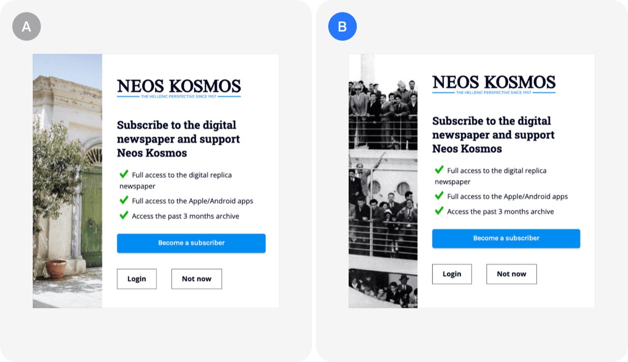
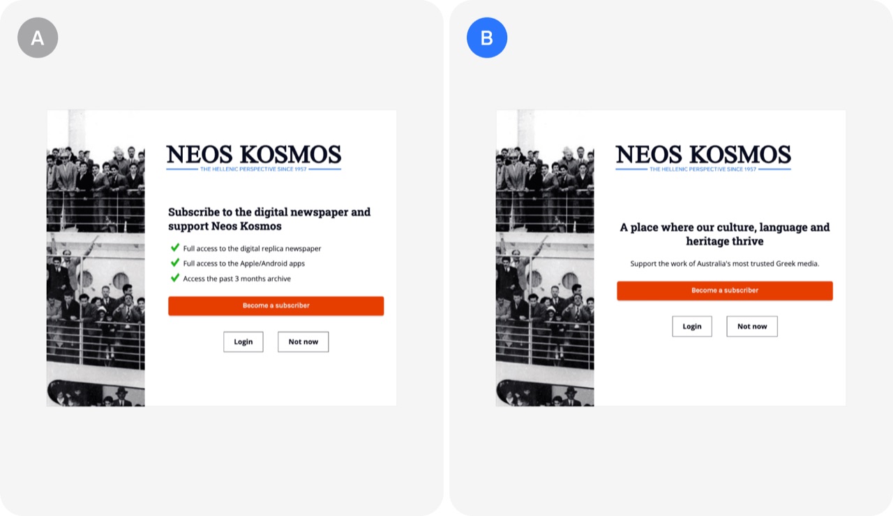
Paywall visuals: Neos Kosmos's A/B test
Neos Kosmos tested two different images on its paywall to see whether the visual alone changes conversion. Swapping a Greek building for an image of immigrants arriving on a boat lifted conversion by 13%.
- Test your paywall image against one that carries emotional meaning for your audience
- Pick paywall visuals that reflect your audience's identity and story, not generic scenery
- Treat paywall imagery as a cheap, isolated A/B test variable
 Paywall & free trial test
Benefits-driven vs emotional appeal messaging: Neos Kosmos's A/B test
A publisher tested a benefits-led paywall message against an emotional, community-focused message that asked readers to support the work. The emotional version lifted conversion rates by 16%.
- Test an emotional, support-our-work paywall message against a benefits list
- Match paywall tone to your audience's cultural identity and community ties
- Test tone of voice on your paywall, not only price and layout
Checkout & sales10
 Checkout & sales test
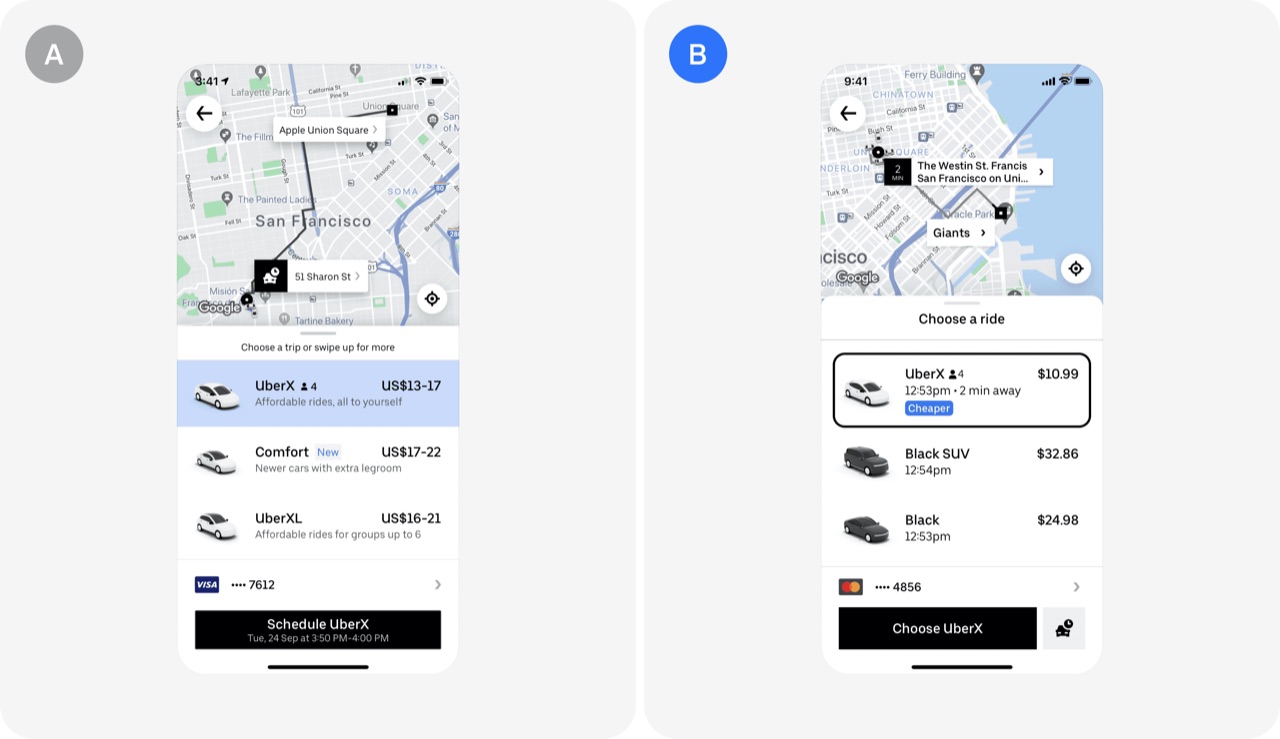
Clearer pricing estimate: Uber's A/B test
Showing a single estimated ride price instead of a price range reduced hesitation and built trust at checkout. The change produced a double-digit increase in rides per user.
- Show one estimated price instead of a price range at checkout
- Assume users anchor on the highest number in any price range
- Reduce price uncertainty at checkout to build trust and lift conversion
 Checkout & sales test
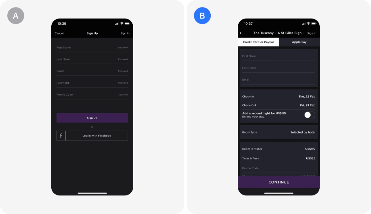
Streamlining checkout process: HotelTonight's A/B test
HotelTonight removed the mandatory account creation step from checkout and asked only for name and email on the order summary screen. The A/B test produced a 15% increase in conversions.
- Remove mandatory account creation from checkout and ask only for name and email
- Replace password creation with a reset link to reduce checkout friction
- A/B test checkout friction removal against your current flow before rolling out
 Checkout & sales test
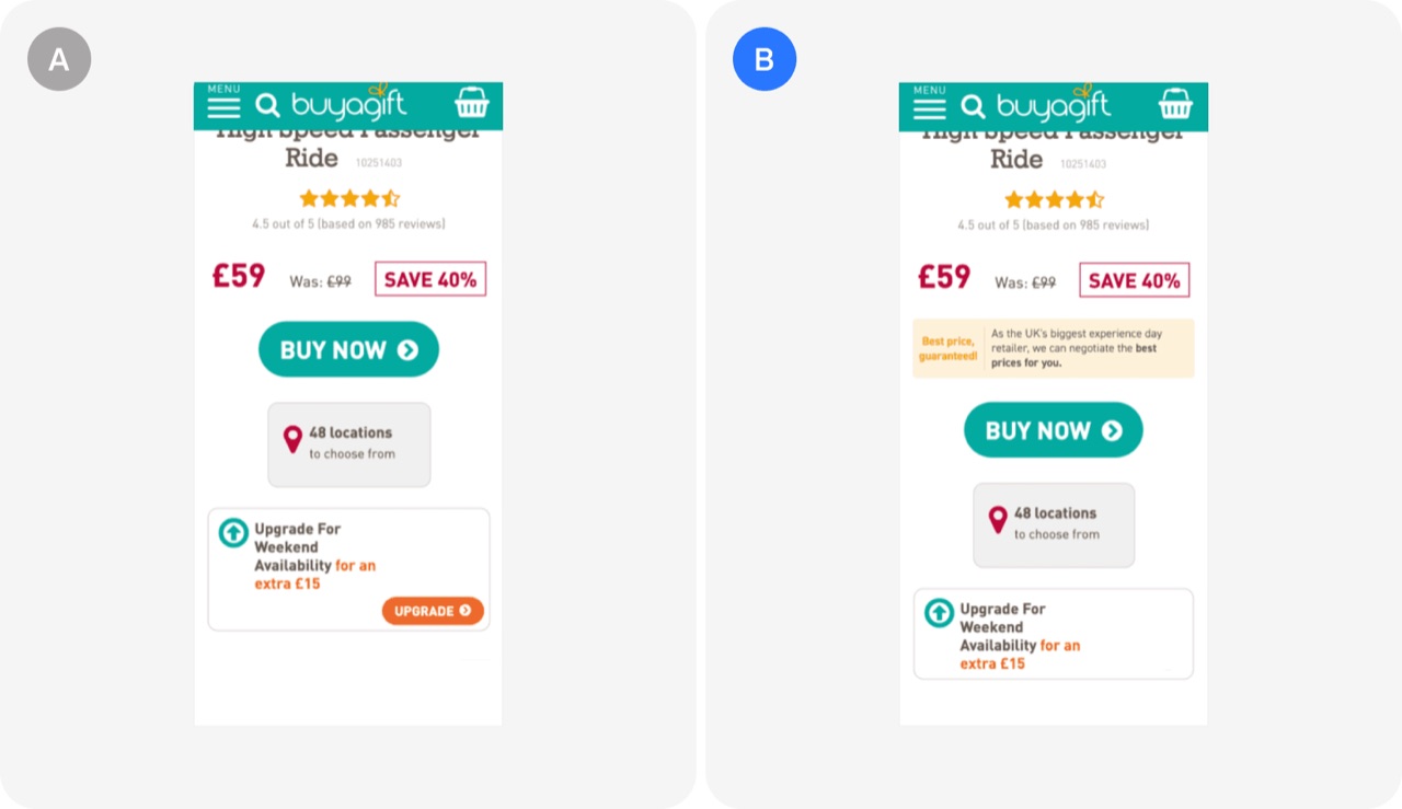
Best price guarantee: Buyagift's A/B test
Adding a best price guarantee widget to product pages reassured shoppers they were getting the lowest price and explained how it was achieved. The test produced a 9.6% increase in sales.
- Add a best price guarantee widget to product pages
- Explain how your low prices are achieved, not just that they are low
- Reduce price-comparison drop-off by reassuring shoppers on the product page
 Checkout & sales test
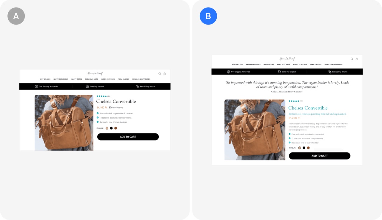
Optimizing product pages with AI: Hannah & Henry's A/B test
Using AI to generate slogans and descriptions and to pick top reviews for key product pages can lift sales. Hannah & Henry reported a 45.67% increase in sales from this test.
- Use AI to write slogans, descriptions and pick top reviews
 Checkout & sales test
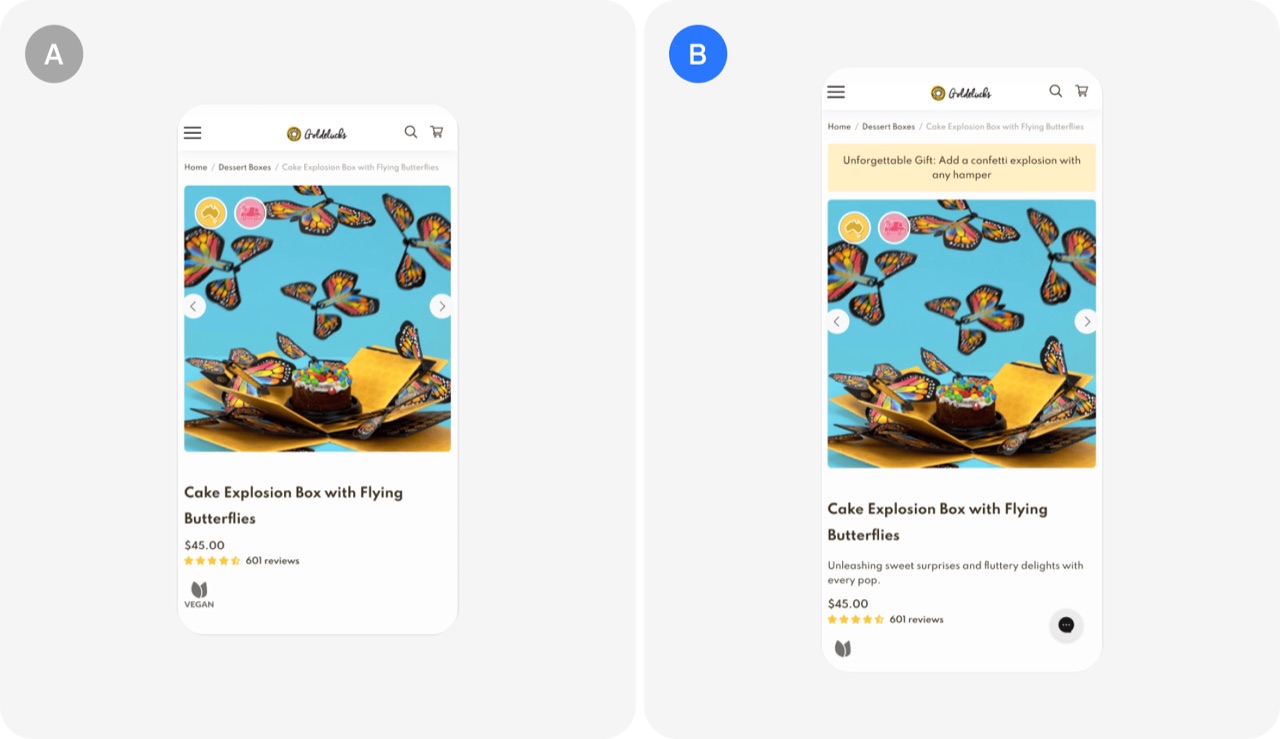
Enhancing product detail page: Goldelucks's A/B test
Adding short, benefit-focused descriptions at the top of product pages helped turn browsing visitors into buyers without discounts. The test produced a 31.56% increase in orders and a 66.2% increase in order revenue.
- Put concise benefit-focused descriptions at the top of product pages
- Lift conversion by improving value presentation instead of offering discounts
- Check high-traffic, low-conversion pages first when looking for test ideas
 Checkout & sales test
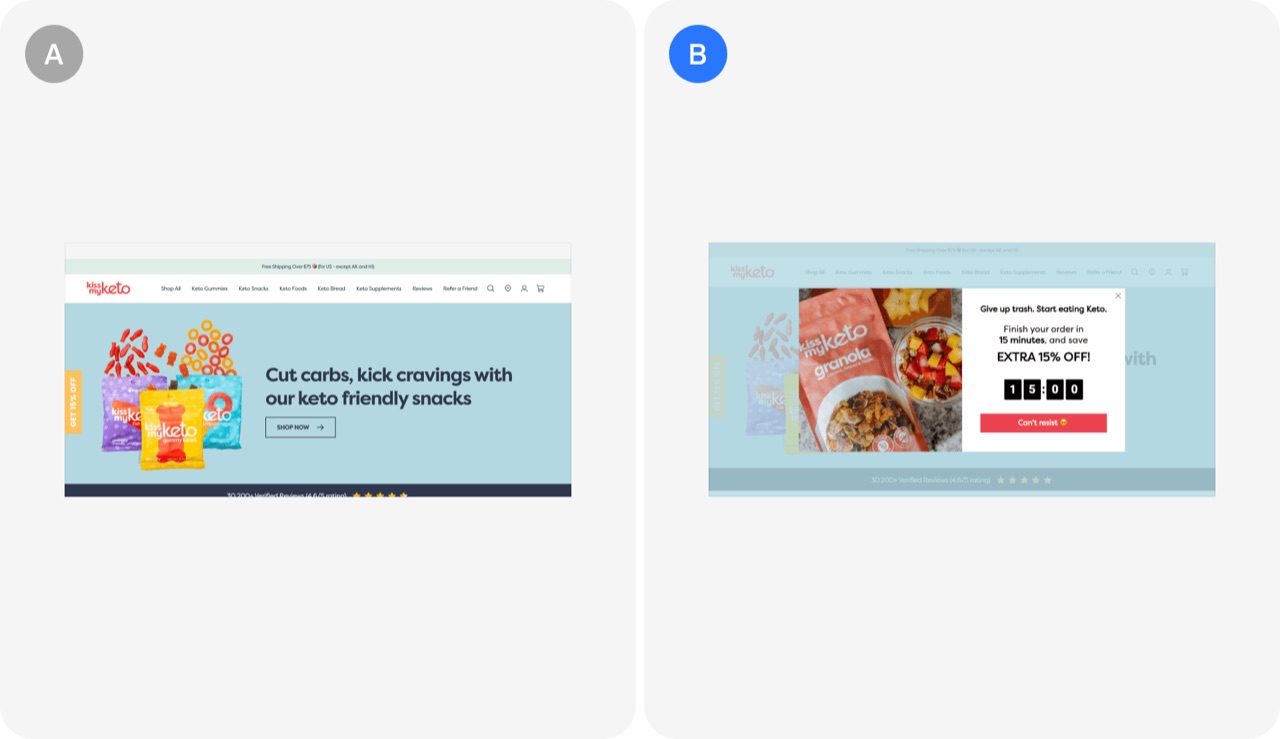
Limited-time discounts for cart abandoners: Kiss My Keto's A/B test
Showing cart abandoners a limited-time 15% discount with a countdown timer pushes hesitant shoppers to finish checkout. The test produced a 15.05% increase in conversion rate.
- Offer cart abandoners a limited-time 15% discount with a countdown timer
 Checkout & sales test
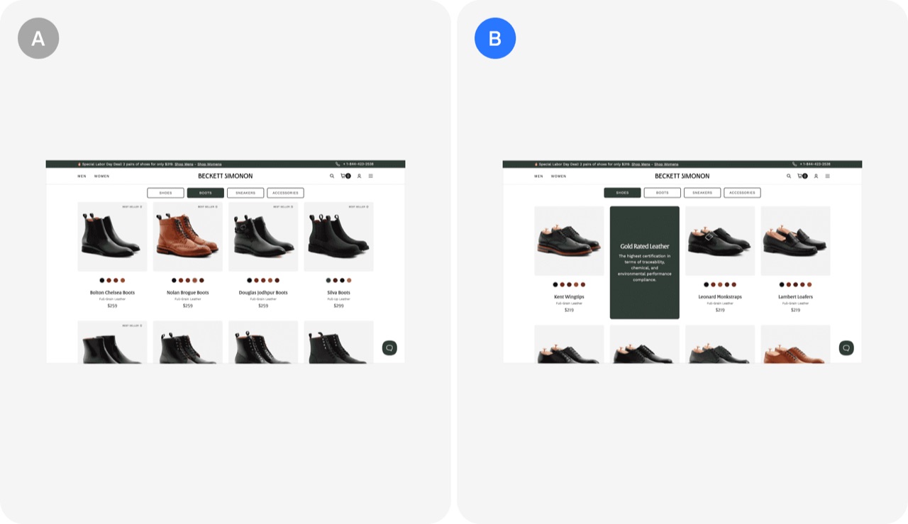
Storytelling card: Beckett Simonon's A/B test
Adding a storytelling panel about sustainability and craftsmanship to the website raised sales. The test produced a 5% sales increase and an annualized return on investment of 237%.
- Add a storytelling panel that states your brand's core values
- Measure brand storytelling tests by return on investment, not just conversion
 Checkout & sales test
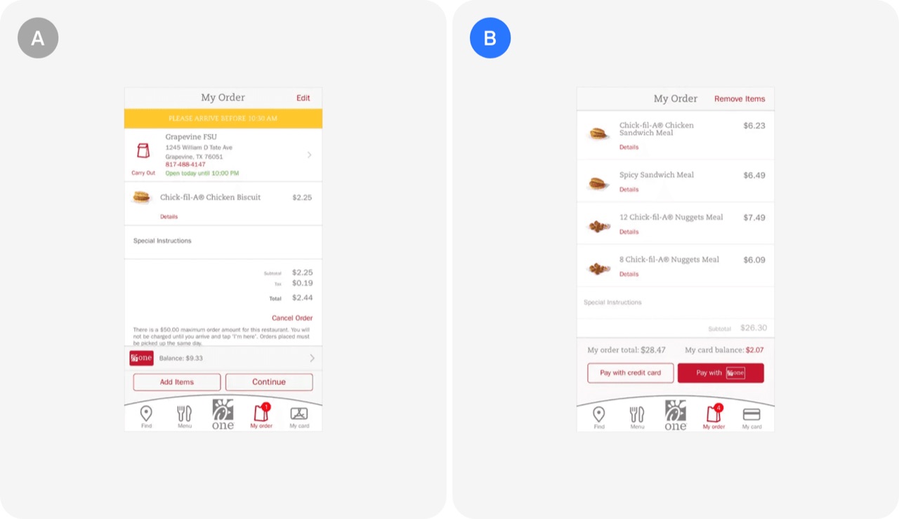
Optimizing clarity of payment options: Chick-fil-A's A/B test
Clear payment options at checkout stop customers from wrongly believing they can only pay with a loyalty card. Chick-fil-A tested new layouts and CTAs and got a 6% increase in credit card payments and customer complaints about the issue dropped to 0.
- Show every accepted payment method clearly at checkout so users do not assume only one works
- Treat customer complaints about confusion as a source of A/B test hypotheses
- Test layouts and CTA wording together when fixing a misleading checkout screen
 Checkout & sales test
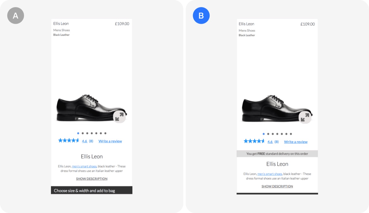
Highlighting free delivery: Clarks's A/B test
Clarks showed that making a free delivery policy visible on product pages can lift completed orders. The test raised conversions by 2.6%.
- Highlight your free delivery threshold on product pages where shoppers decide
- Check whether customers actually know about your existing perks before building new ones
- Use patterns from a large experiment database to form test hypotheses
 Checkout & sales test
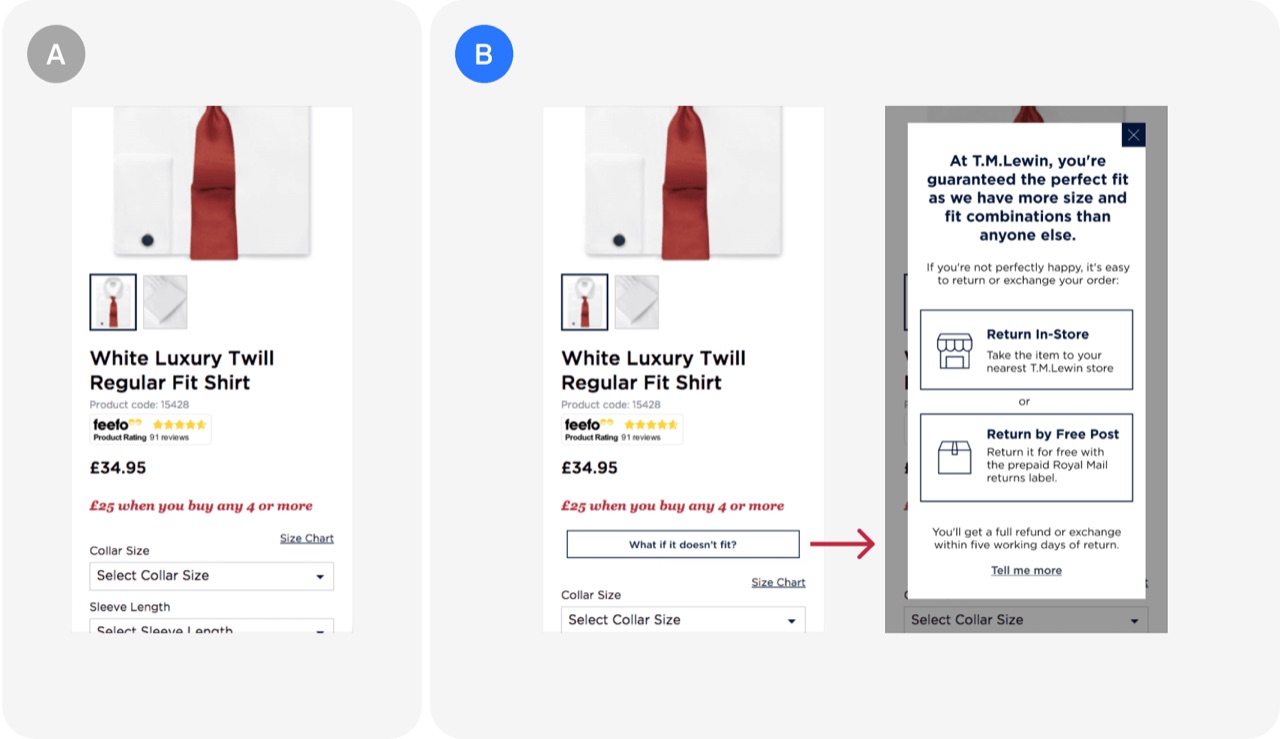
Clear & transparent returns policy: T.M. Lewin's A/B test
Making the returns policy for fit issues clear and visible during purchase addresses a key customer worry and makes buying simpler. T.M. Lewin's test of this design produced a 50% increase in conversion rate and a 7% uplift in monthly sales.
- Show an easy returns policy for fit issues at purchase
- Address the customer's main purchase concern directly in the design
- Benchmark a clear returns policy test against a 50% conversion gain
Onboarding8
 Onboarding test
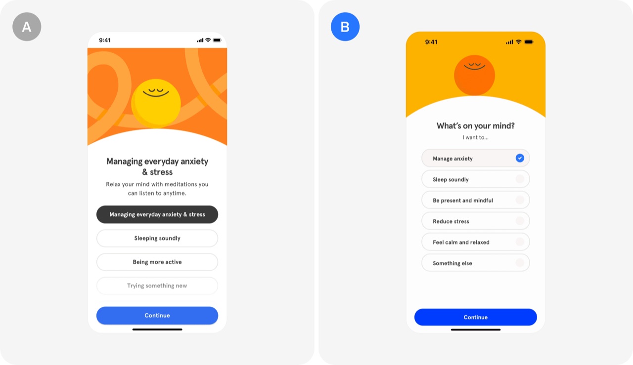
Onboarding with multi-intent queries: Headspace's A/B test
Headspace let users pick several reasons for using the app during onboarding instead of just one. This multi-intent change produced a 10% increase in free trial conversion.
- Let users select multiple goals during onboarding instead of forcing one
- Use multi-intent answers to tailor the offering and lift free to paid conversion
 Onboarding test
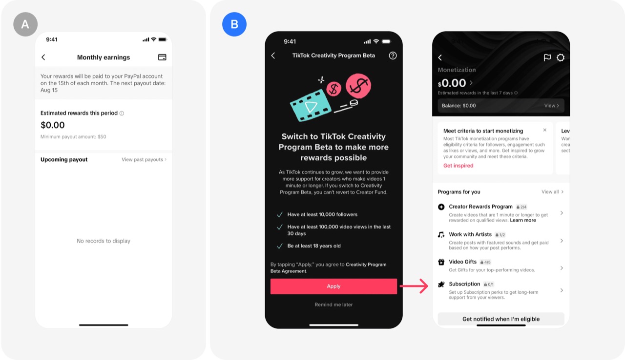
Delayed bank account setup: TikTok's A/B test
Delaying the bank account step in a creator revenue-sharing program, so creators could start making content and see potential earnings first, cut onboarding drop-off. The change produced a 25% increase in creators enrolling.
- Delay the bank account step until users have seen value
- Move sensitive data requests like KYC and banking details later in the flow
- Show potential earnings before asking for payout details
 Onboarding test
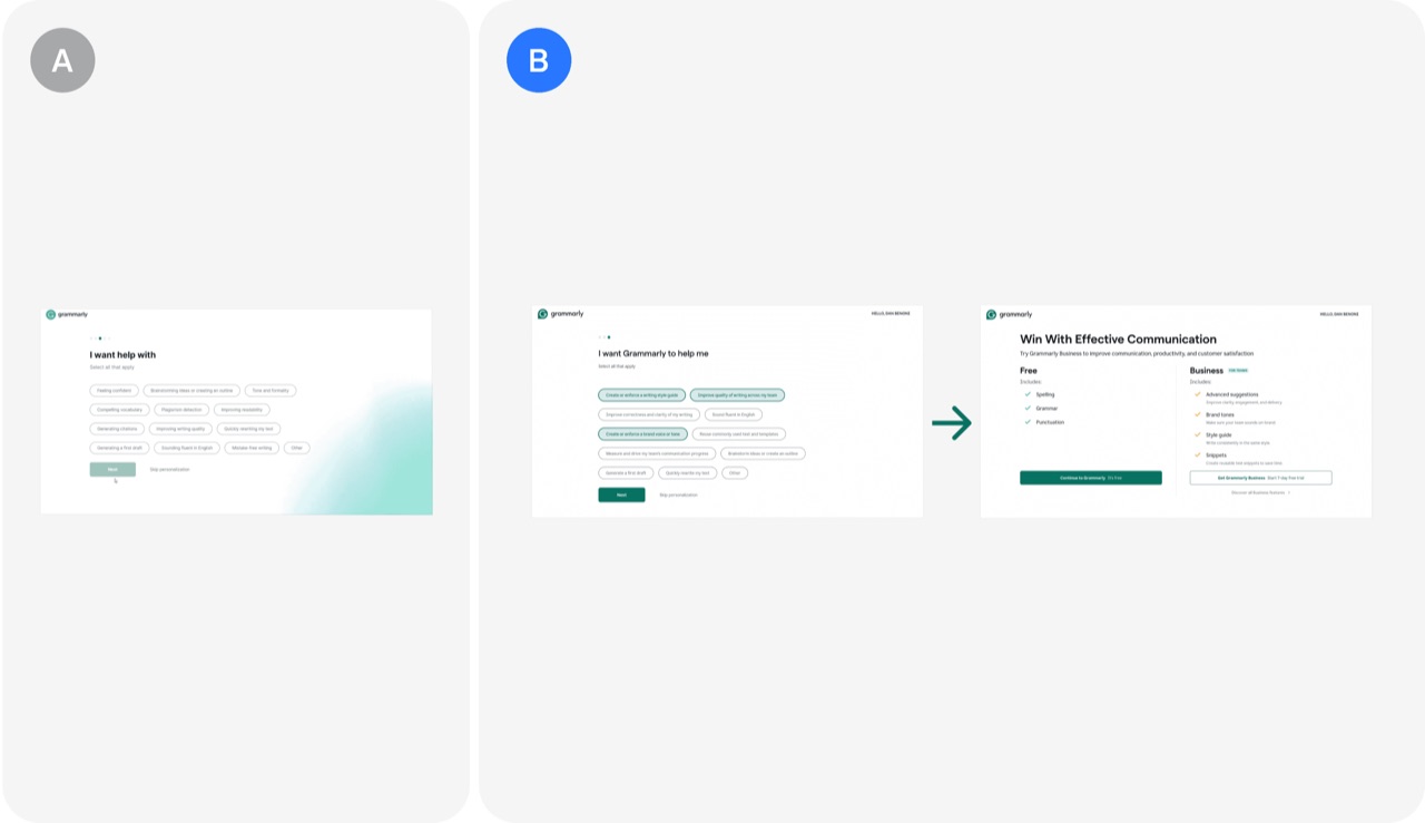
Personalized pricing recommendations: Grammarly's A/B test
Grammarly uses answers from an onboarding questionnaire to recommend a tailored pricing plan and updates the pricing page to match. The result was a 10-20% increase in upgrade rates.
- Recommend a pricing plan based on onboarding questionnaire answers
- Update the pricing page to reflect what users said they need
- Benchmark: personalized plan recommendations can lift upgrades by 10-20%
 Onboarding test
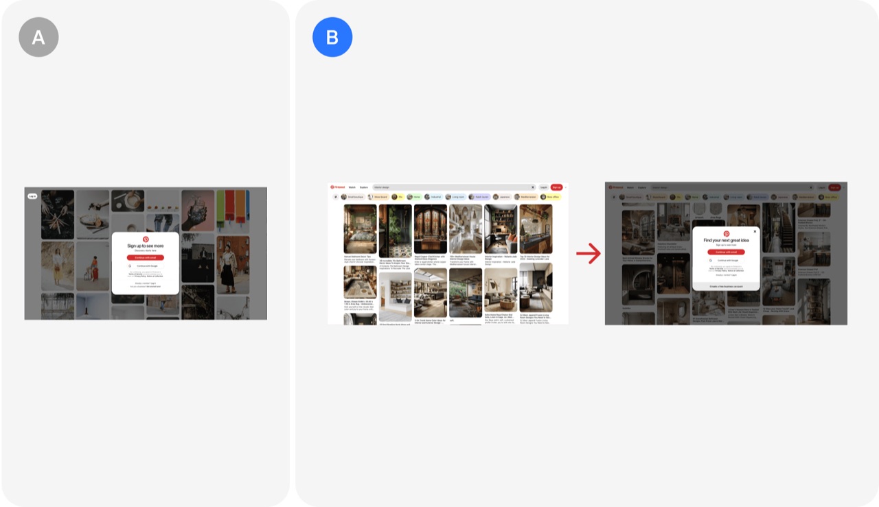
Free content exploration before signup: Pinterest's A/B test
Letting visitors scroll through about three pages of content before asking them to sign up reduces early friction by showing value first. Pinterest's test of this approach produced a 15-20% increase in signups.
- Let visitors browse three pages of content before asking for signup
- Show your product's value before requesting an account
- Expect a 15-20% signup lift from testing a delayed signup wall
 Onboarding test
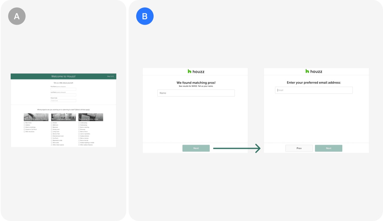
Separating contact information into multiple screens: Houzz's A/B test
Houzz split its contact form into three single-field screens (name, email, phone) instead of one combined form. Even with more clicks, conversion rose by more than 15%.
- Split contact forms into one screen per field to lift conversion
- Optimize for cognitive load per step, not for the fewest clicks
 Onboarding test
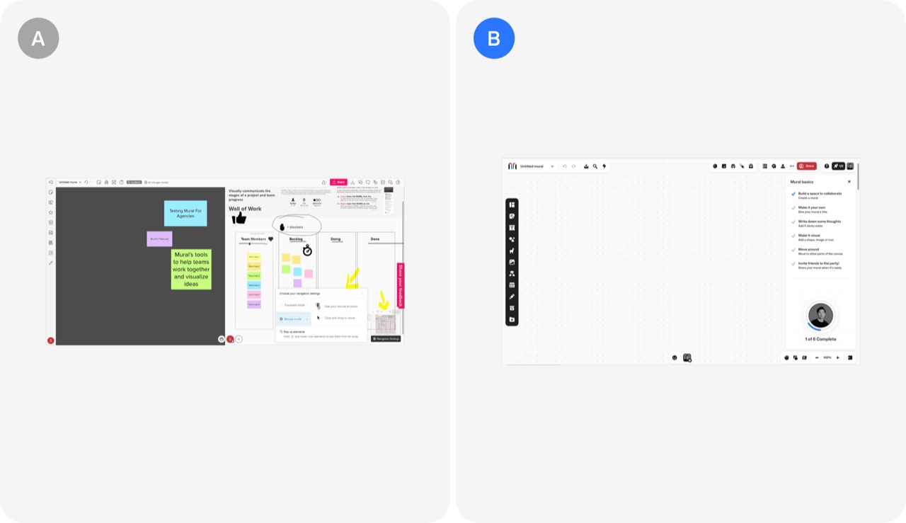
Onboarding checklist: Mural's A/B test
Mural replaced scattered pop-ups and banners with a five-step onboarding checklist that guides new users through their first session. The change produced a 10% relative increase in 1 week retention.
- Replace pop-ups and banners with a single five-step onboarding checklist
- Build checklist steps around actions that predict long-term engagement
- Track 1 week retention as the success metric for onboarding changes
 Onboarding test
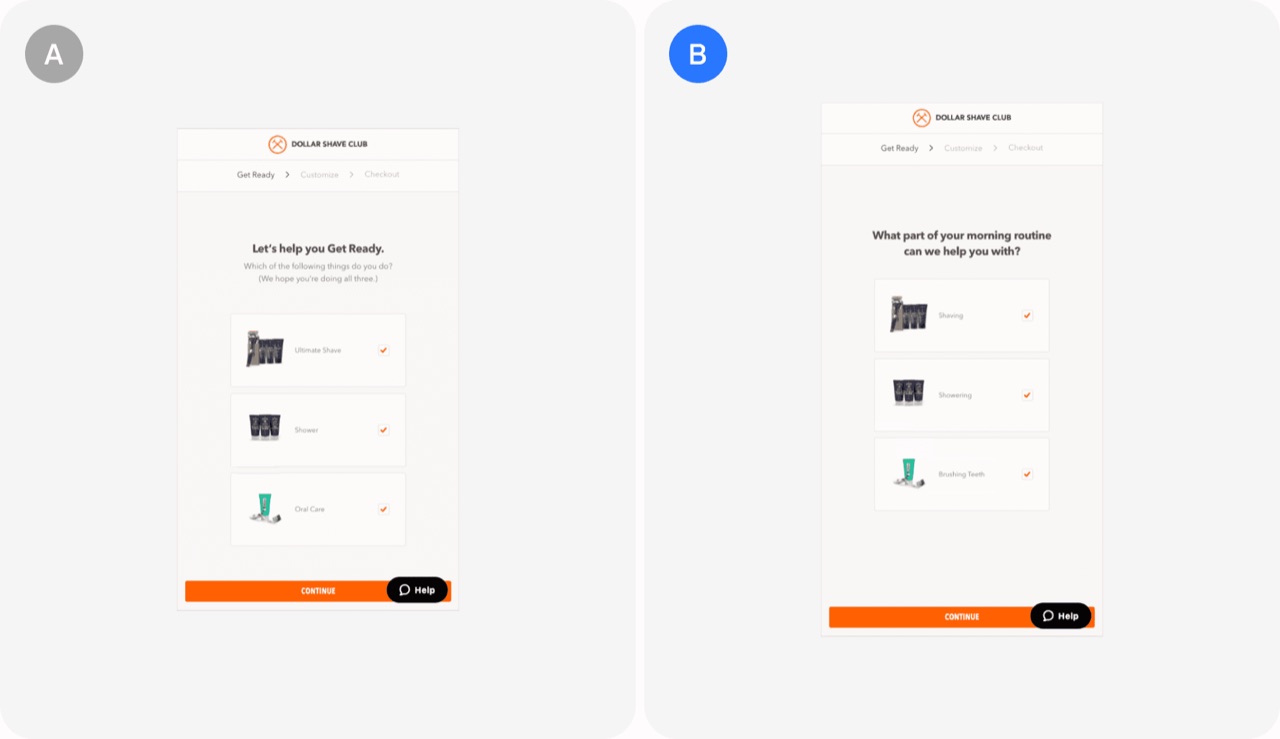
Conversational tone in onboarding: Dollar Shave Club's A/B test
Dollar Shave Club rewrote the first steps of its subscription funnel in a more conversational, playful tone that matches the brand's voice. The change produced a 5.24% increase in subscriptions.
- Write early onboarding steps in a conversational tone that matches your brand
- Test brand voice changes in the funnel against the current copy
- Align funnel emotional appeal with the brand's playful persona
 Onboarding test
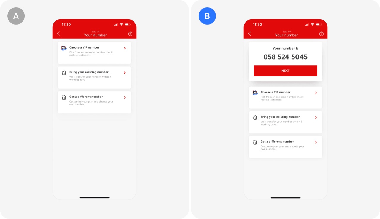
Simplifying onboarding: Virgin Mobile UAE's A/B test
Virgin Mobile UAE cut friction in sign-up by pre-assigning a random phone number instead of forcing users to pick or transfer one first. The change lifted progression to registration by 9% and cut drop-off by nearly 18%.
- Pre-assign a default choice so users can skip a hard decision
- Find the sign-up step with the highest drop-off and test removing its upfront decision
- Keep an easy way to change the default so you do not remove user control
User engagement & retention4
 User engagement & retention test
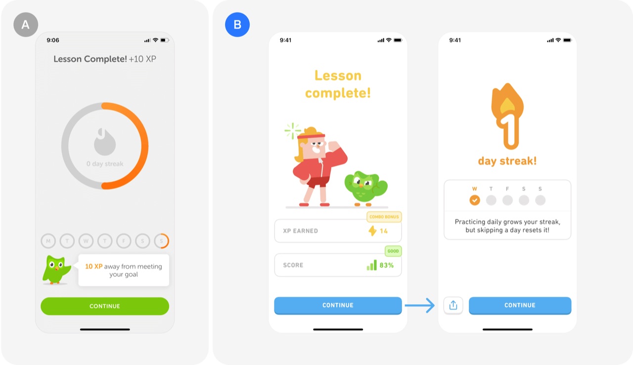
Decoupling streaks from daily goals: Duolingo's A/B test
Duolingo decoupled streaks from daily goals so that one lesson a day keeps a streak alive, no matter how high the learner set their goal. The change raised the number of learners on a 7+ day streak by over 40%.
- Let one small action keep the streak alive, whatever the goal
- Separate the streak habit from ambitious goals so high goals do not cause churn
- Measure streak health by the share of users reaching 7+ day streaks
 User engagement & retention test
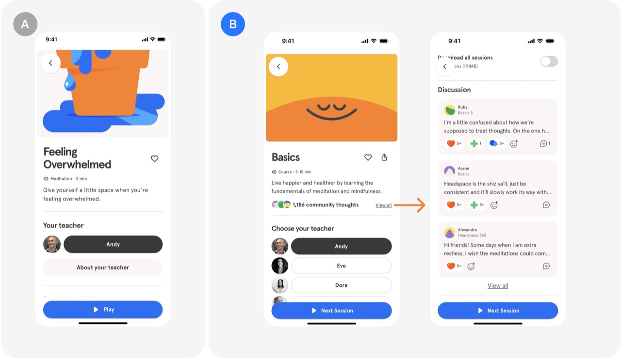
Social validation: Headspace's A/B test
Showing positive feedback and encouraging thoughts from other users during meditation sessions adds real-time social validation to the product. The test lifted the survival rate of free trial users by 3%.
- Show encouraging feedback from other users inside the core experience
- Use social validation to keep free trial users from dropping off
 User engagement & retention test
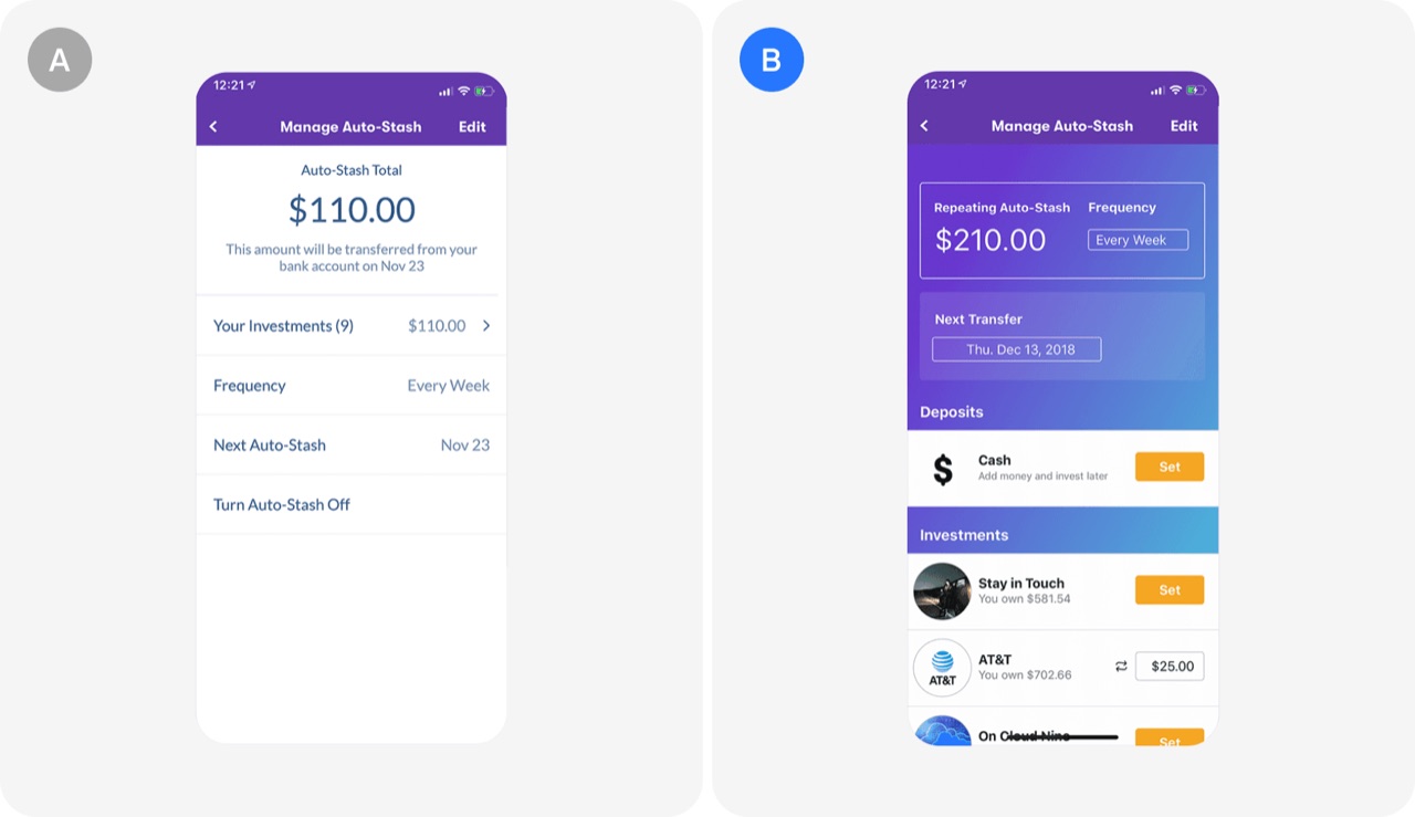
Displaying individual investment amount: Stash's A/B test
Showing each investment's individual amount, not only the total portfolio value, helped users stay on Auto-Stash, the automatic saving feature. The change led to 12% more users still saving automatically 8 months later.
- Show individual investment amounts, not just total portfolio value, to keep users on recurring saving
- Judge retention tests on long-run behavior, such as use of a recurring feature months later
 User engagement & retention test
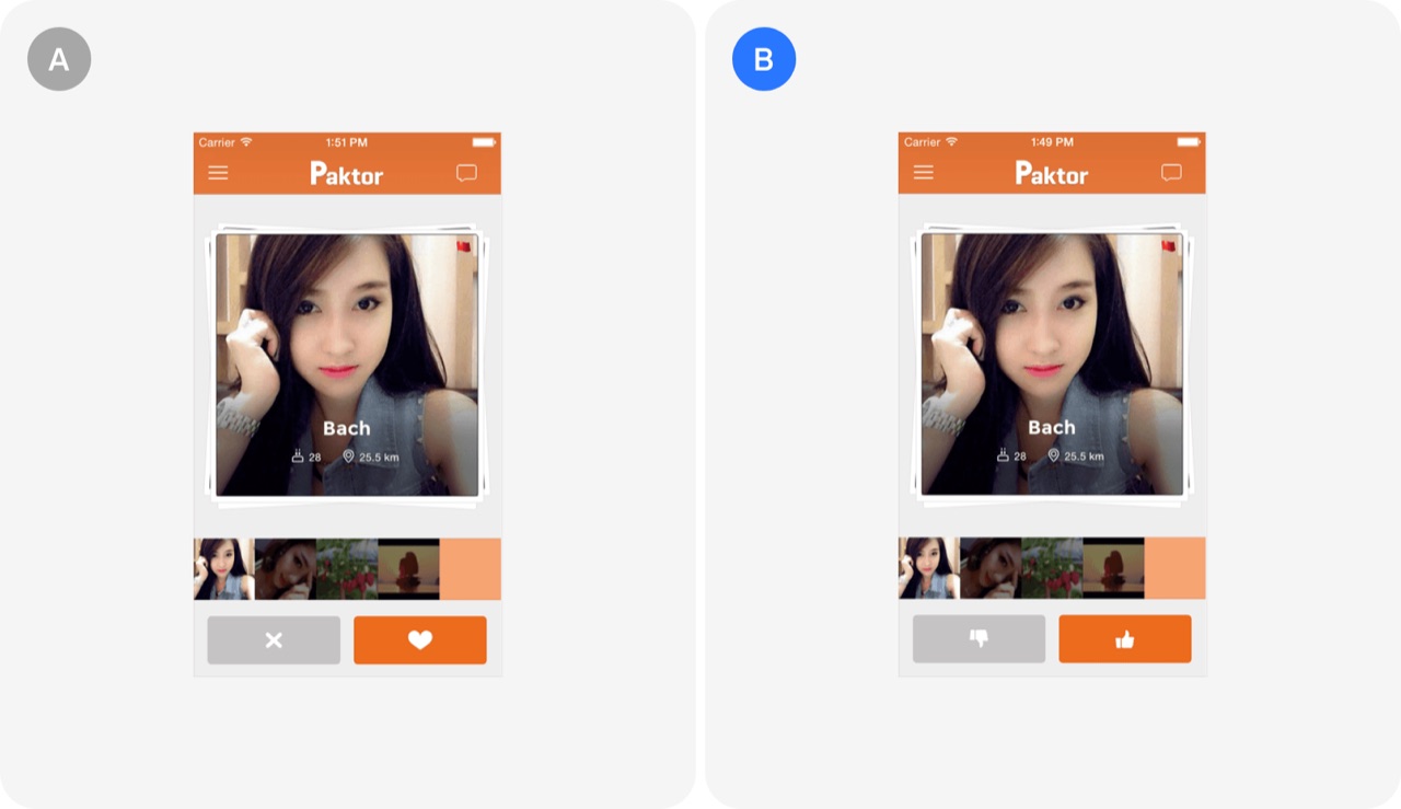
Heart vs thumbs up icon: Paktor's A/B test
Paktor tested a heart and X for its like and dislike buttons against thumbs up and thumbs down icons. The thumbs design won, lifting like clicks by 6%, dislike clicks by 4.3% and repeat app usage by 2.3%, so the expected winner was not the best performer.
- Test familiar thumbs up and down icons against heart and X buttons
- Do not assume the more emotional icon design will beat the plain one
- Measure repeat usage as well as button clicks in UI tests
Referral2
 Referral test
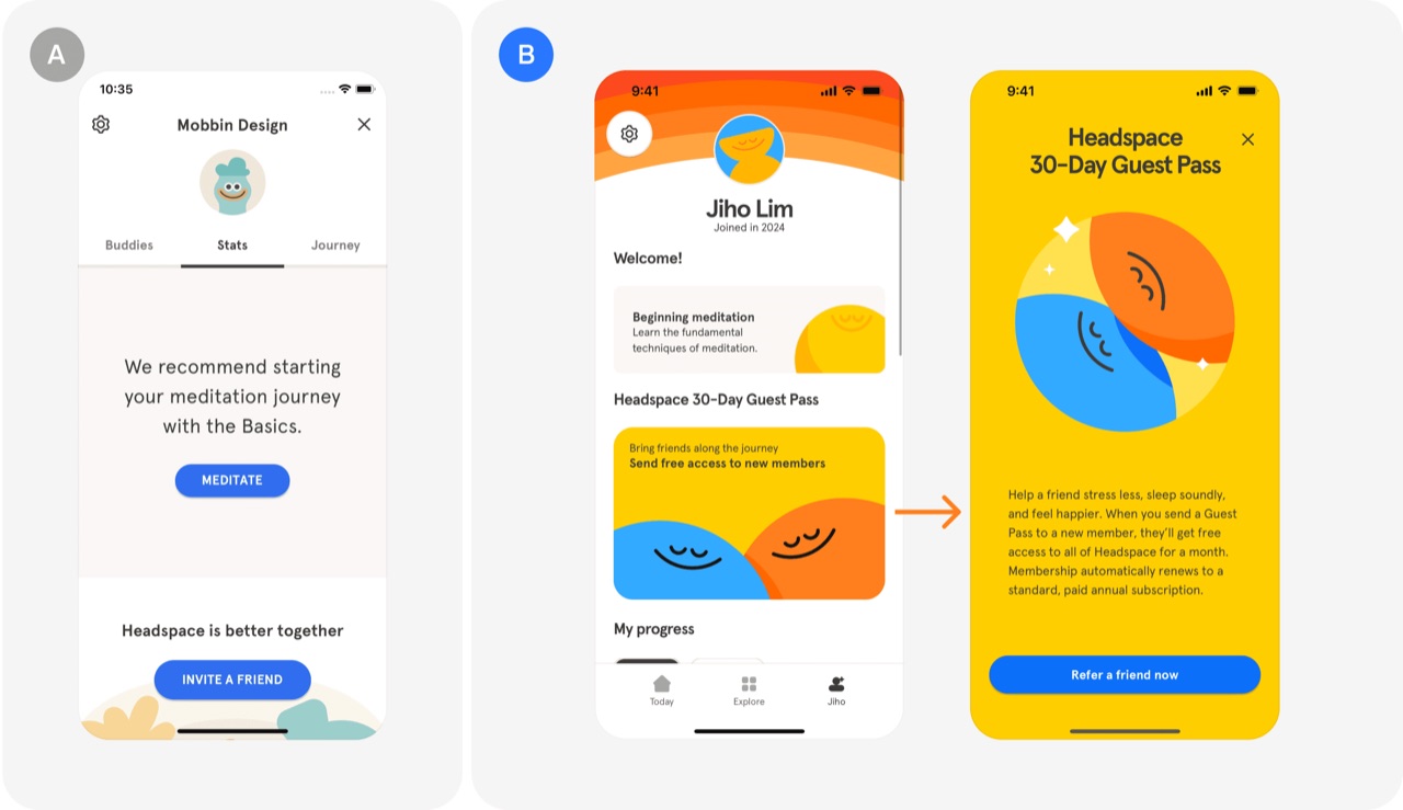
30-Day Guest Pass: Headspace's A/B test
Headspace tested a referral program called 30-Day Guest Pass that gives invited friends a 30-day free trial instead of the standard 14 days. It lifted new signups by 7% and revenue by 8% through better trial to paid conversion from referred users.
- Offer referred friends a trial twice as long as standard
- Use current user recommendations to convert skeptics into trial users
- Measure referral programs on revenue, not only signups
 Referral test
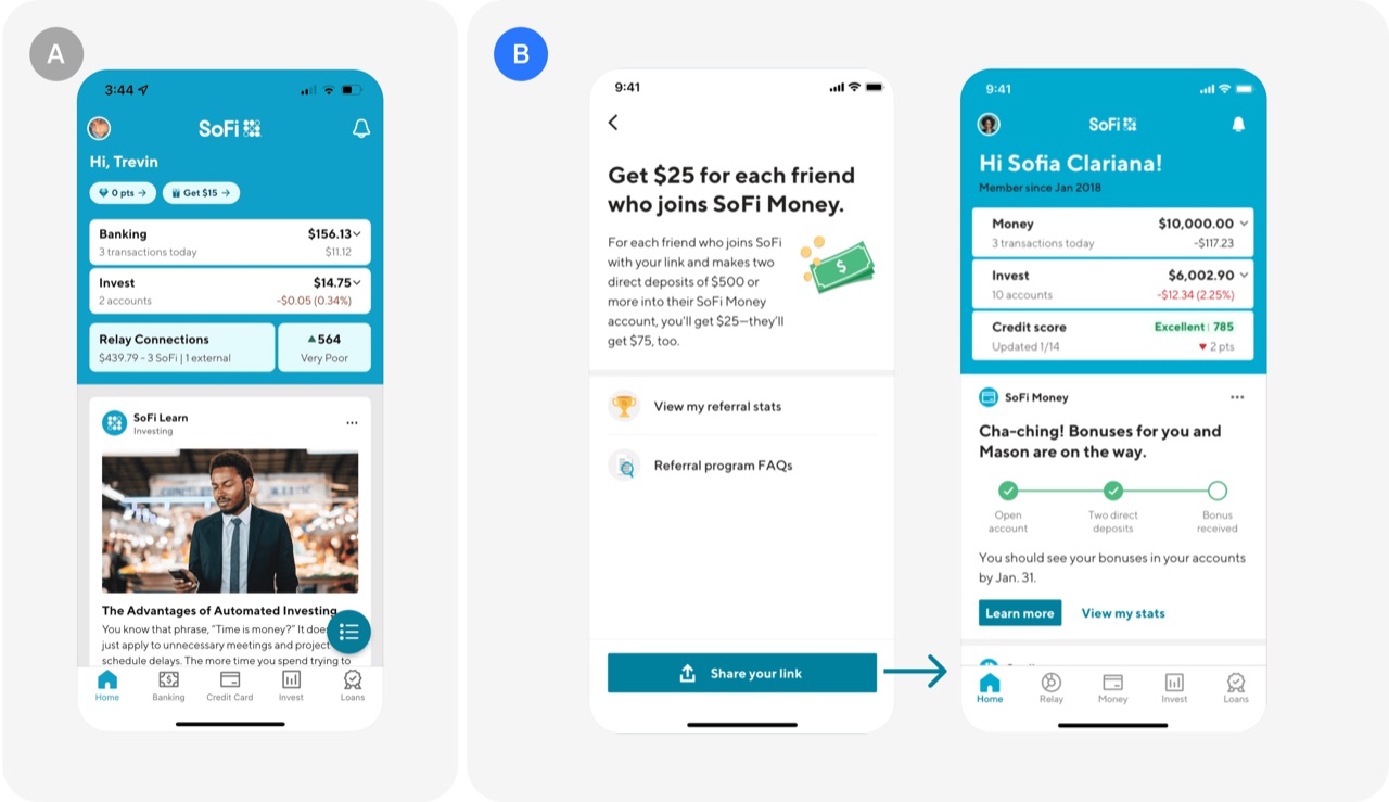
Real-time referral tracking: SoFi's A/B test
SoFi made referrals transparent by showing users in real time how far each invited friend had progressed through sign-up, instead of revealing success only when a reward arrived. Referrals grew 20x and went from 2% to 40% of all new user sign-ups within 3 months.
- Show referrers real-time progress of each friend through sign-up stages
- Display potential earnings clearly to motivate referrers to keep inviting
- Do not hide referral status until the reward is paid
Monetization awareness2
 Monetization awareness test
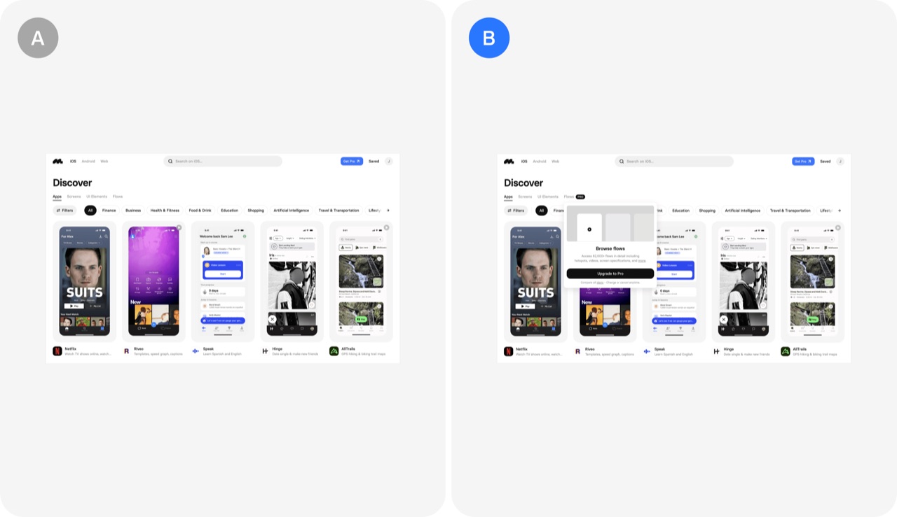
Pro badge: Mobbin's A/B test
Labeling paid-only features with a Pro badge tells free users what upgrading gets them and avoids surprise paywalls. In Mobbin's test, this single change raised free-to-paid conversions by 35%.
- Add Pro badges to features that only paying users can access
- Tell free users which features are paid before they hit a paywall
- Raise monetization awareness as a lever for free-to-paid conversion
 Monetization awareness test
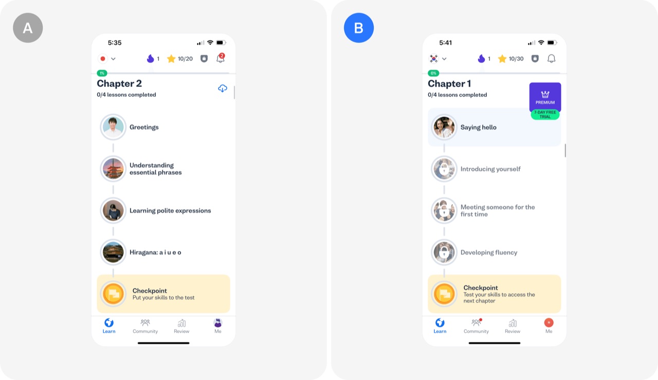
Content locking: Busuu's A/B test
Busuu limited free users to one language and made multiple languages a Premium feature, targeting dedicated users who switch between languages. The test produced an 83% increase in conversions among these power users.
- Lock multi-language access behind Premium to convert dedicated free users
- Gate on behavior that signals power users, not on all users
- Test content locking as a hypothesis with a defined user segment
Misc5
 Misc test
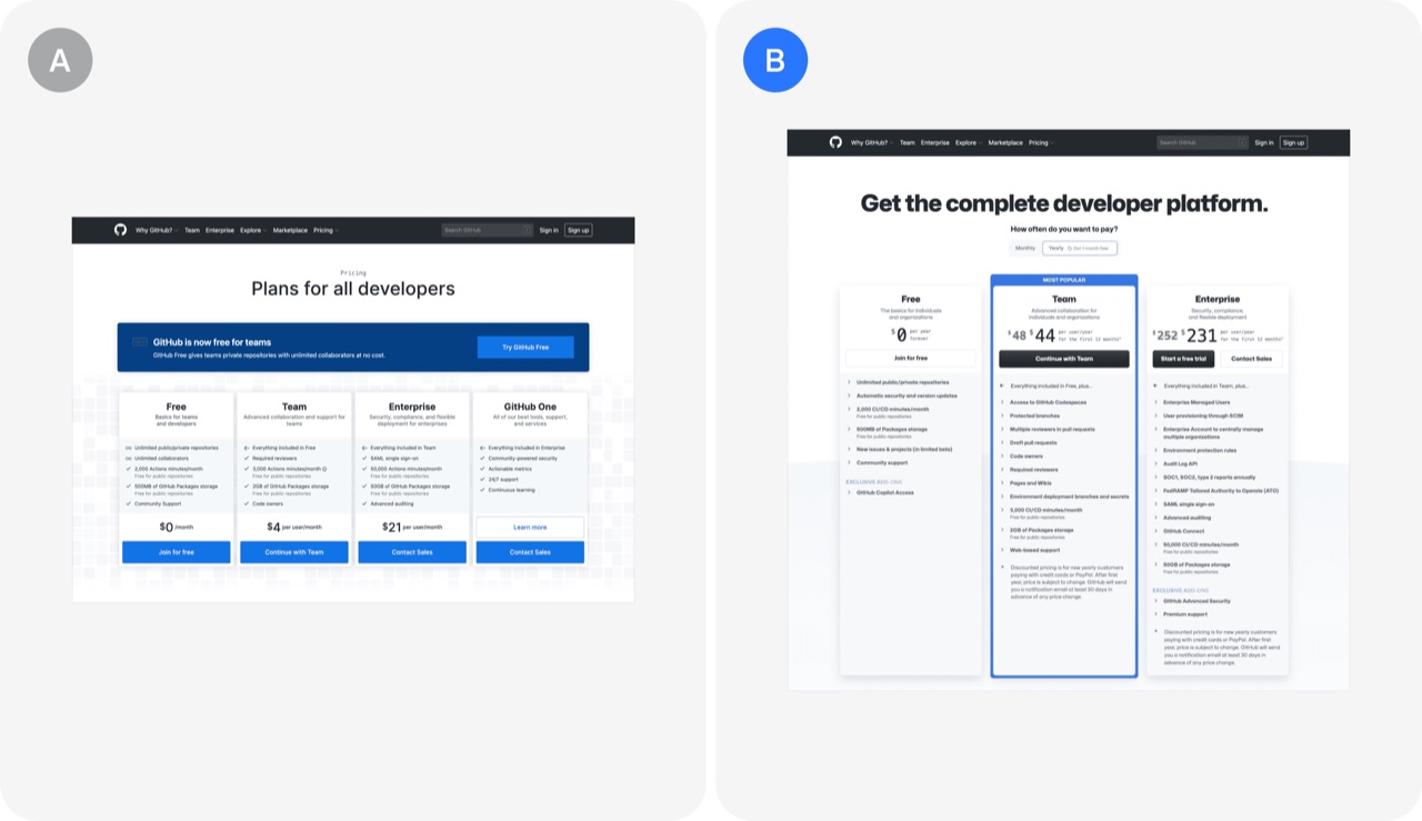
Visual contrast between pricing tiers: Github's A/B test
GitHub redesigned its pricing page by sharpening the contrast between tiers, highlighting the features customers value most, and cleaning up the look. The changes lifted free and paid signups by more than 20 percent.
- Increase visual contrast between pricing tiers by showing more features in higher tiers
- Emphasize the features customers value most on your pricing page
- Remove outdated pricing tiers and use vibrant colors for a cleaner page
 Misc test
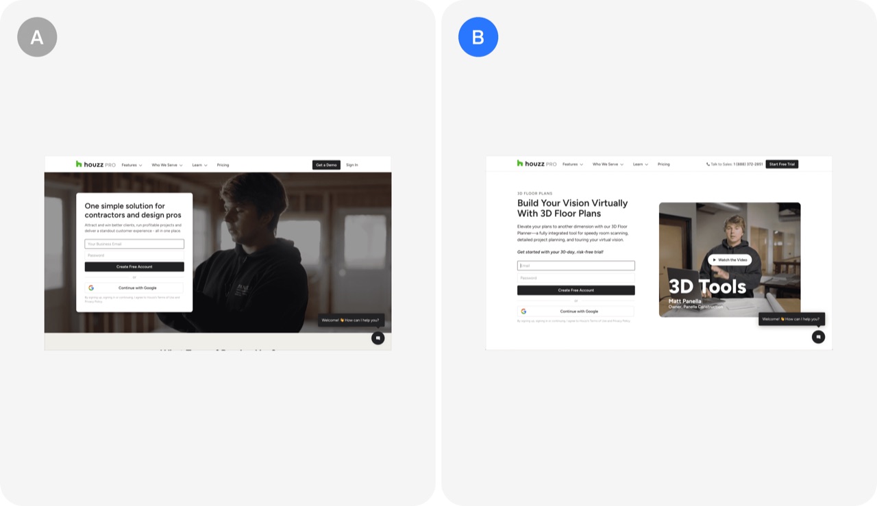
Customized landing page for paid traffic: Houzz's A/B test
Houzz built a dedicated, distraction-free landing page for paid traffic that focused only on 3D floor plans. The test lifted free trial starts by 5%.
- Build a dedicated landing page for paid traffic around one feature
- Strip headers and extra information from paid landing pages
- Match landing page content to the intent of paid users
 Misc test
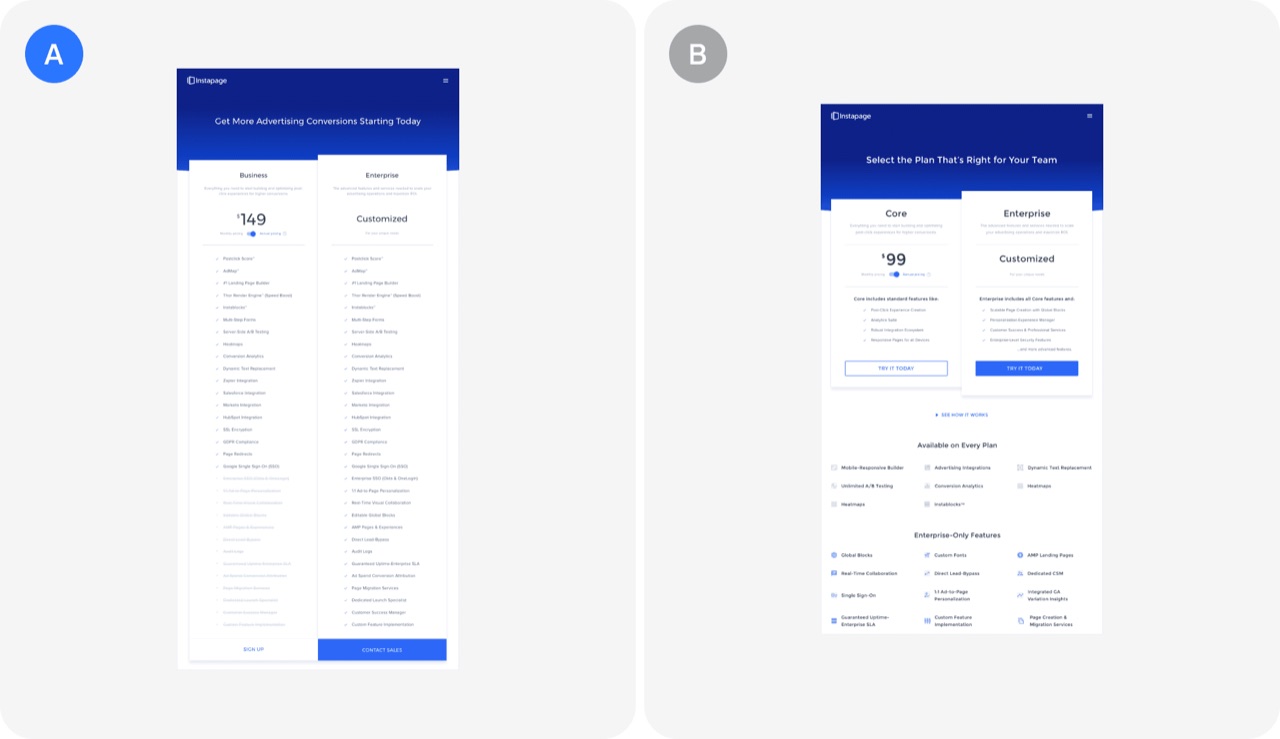
Simplified pricing page layout: Instapage's A/B test
Instapage tested a simplified pricing page that removed extra details and highlighted key features to make plan comparison easier. The simpler version did not win: the original converted slightly better, 3.67% versus 3.44%.
- Test simplified pricing pages before shipping, because less detail can convert worse
- Compare your pricing page conversion against a 3.4% to 3.7% reference point
- Check whether a small conversion gap is real before declaring a winner
 Misc test
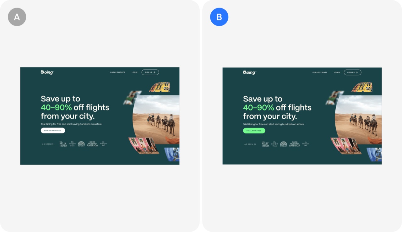
“Trial for free” CTA: Going's A/B test
Changing a homepage CTA from "Sign up for free" to "Trial for free" made the premium free trial the clear action instead of a generic free signup. It produced a 104% month-over-month increase in trial starts.
- Rename the CTA to name the premium trial, not a generic free signup
- Test small copy changes on the main CTA before bigger redesigns
- Make the free trial option more prominent to emphasize premium value
 Misc test
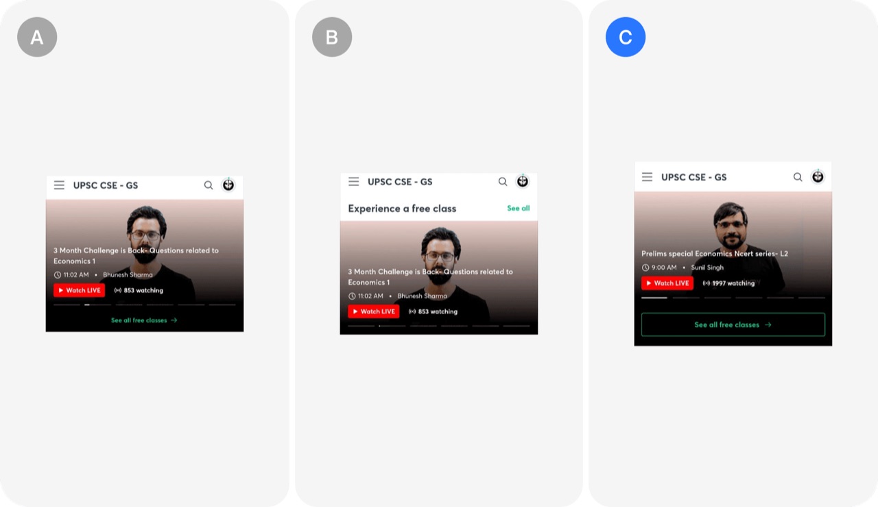
Optimal CTA design: Unacademy's A/B test
A CTA design test on a class carousel showed that a thin-bordered button beat both the original and a button that matched the existing UI. The winning variant drove 13k clicks versus 9k and 7k for the others.
- Test a thin-bordered button for a secondary CTA like See all
- Do not assume a CTA that matches existing UI components will win
- Split users equally across variants and measure clicks on the CTA