 Caddie
The bottom line
Build ramps, not walls: frame the trial as a gain
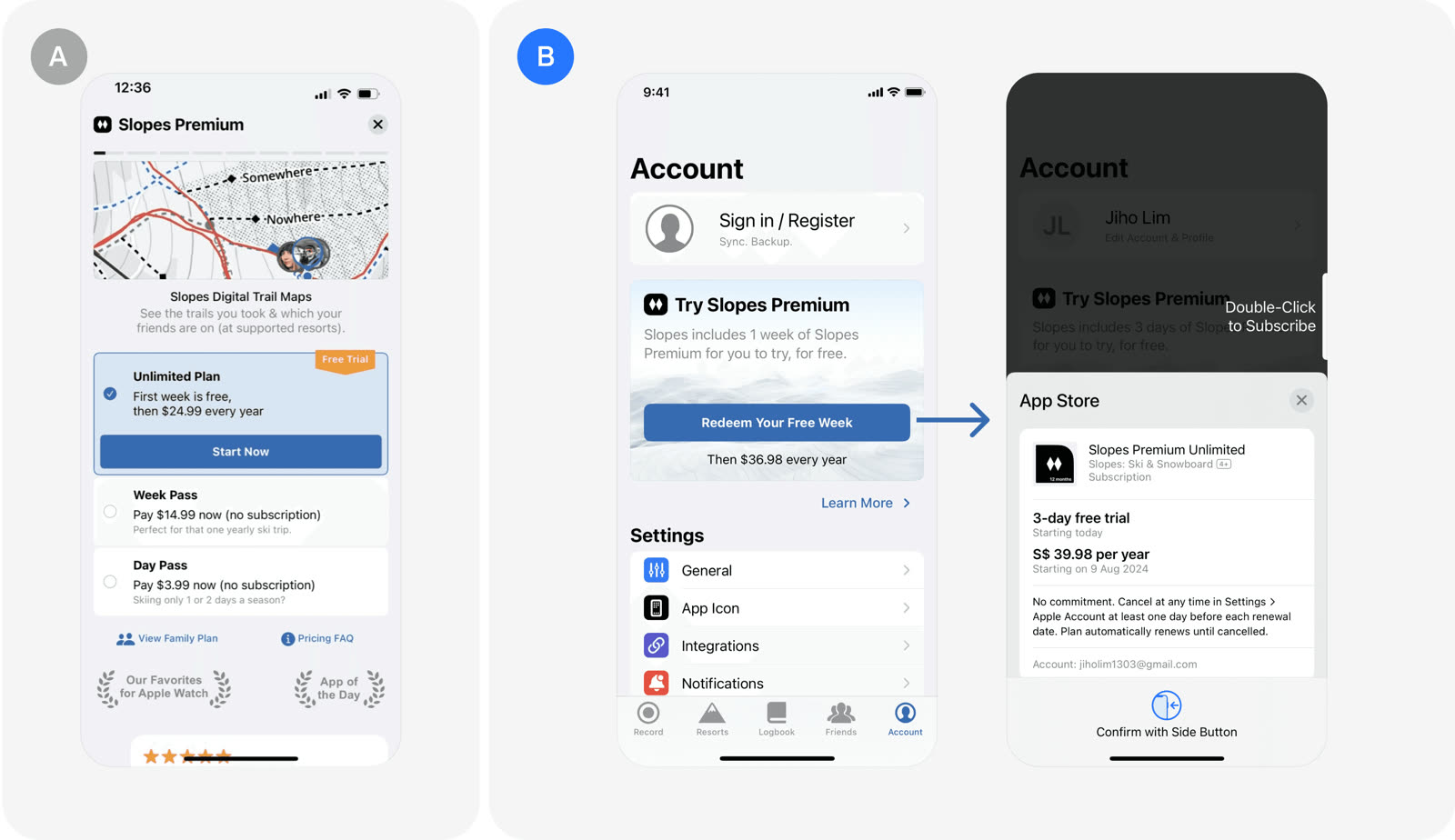
Slopes let users start a free trial with one touch, skipping the separate paywall screen, and trial starts rose 25%. Framing the offer as "Redeem your free 2 weeks" makes users feel they gain something rather than give something up.
Key takeaways
- A one-touch payramp beat a separate paywall screen for starting trials. It works as a quick-start mechanism with fewer steps.
- Trial starts improved by 25%.
- Gain-focused copy makes the offer feel like a reward. Users feel they receive something instead of handing something over.
- The copy reads "Redeem your free 2 weeks".
- Simplicity is the core of the design. Removing the secondary paywall screen takes out a hurdle between the user and the trial.
The test: Payramp, not Paywall
Slopes replaced a secondary paywall screen with a payramp that starts a free trial in a single touch.
- The payramp bypasses the second paywall screen.
- Users begin a free trial with one touch.
- The design is simple and acts as a quick-start mechanism.
- The copy stresses what the user gets.
- "Redeem your free 2 weeks" frames the trial as a gain.
Result
The payramp lifted trial starts by 25%
Separate paywall100
One-touch payramp125
The payramp lifted trial starts by 25%.
- Trial starts rose 25%.
- The test belongs to the paywall and free trial category.
- It was first written up in a Slopes Diaries post on building ramps, not walls.
In the growth library
Slopes, Paywall & free trial test. Slopes replaced a secondary paywall screen with a one-touch "payramp" that starts a free trial right away. The change produced a 25% improvement in trial starts.
Lessons that draw on this:
More from  abtest.design · The whole library, and ask it anything