 Caddie
The bottom line
Instapage's simplified pricing page did not beat the original: the original converted at 3.67% against 3.44% for the variant. Cutting detail to make plans easier to compare did not raise conversion here.
Key takeaways
- The original pricing page slightly outperformed the simplified variant. Version A converted better than version B.
- Original (A): 3.67% conversion.
- Variant (B): 3.44% conversion.
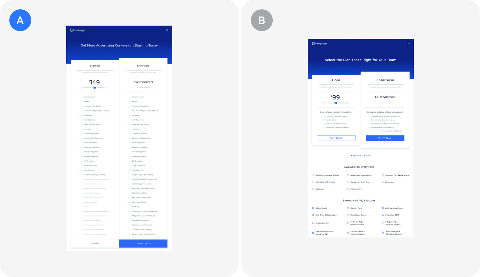
- The variant aimed to make plans easier to compare. It removed unnecessary details and highlighted key features.
- The goal was to reduce cognitive load and improve clarity.
- Simplifying a layout does not guarantee a conversion gain. The change meant to help visitors choose faster ended up slightly behind.
The test
What the simplified variant changed, and how it scored
| Original (A) | Simplified (B) | |
|---|---|---|
| Detail level | Existing full layout | Unnecessary details removed |
| Feature emphasis | Unchanged | Key features highlighted |
| Intended benefit | Baseline | Faster plan comparison |
| Conversion | 3.67% | 3.44% |
Instapage tested a leaner pricing page layout against the existing one.
- The variant removed clutter and put key features first.
- Unnecessary details were taken out.
- Key features were highlighted so visitors could compare plans.
- The intent was to help users quickly spot the best option.
The result
The original pricing page narrowly beat the simplified one
Original (A)3.67%
Simplified (B)3.44%
The original layout converted slightly better than the simplified one.
- A won by a small margin.
- Original (A) converted at 3.67%.
- Variant (B) converted at 3.44%.
In the growth library
Instapage, Misc test. Instapage tested a simplified pricing page that removed extra details and highlighted key features to make plan comparison easier. The simpler version did not win: the original converted slightly better, 3.67% versus 3.44%.
Lessons that draw on this:
More from  abtest.design · The whole library, and ask it anything