 Caddie
The bottom line
Github's pricing page redesign, which sharpened the contrast between tiers, raised free and paid signups by more than 20%. Making higher tiers stand out and showing what customers value most can lift conversions.
Key takeaways
- Github made three changes to its pricing page. Together they produced a 20%+ rise in signups.
- The changes covered tier contrast, feature emphasis and page aesthetics.
- Both free and paid signups rose by more than 20%.
- Higher tiers were made to stand out from lower ones. More highlighted features gave each step up a clearer difference.
- The extra highlighted features sat in the higher tiers.
- Features customers valued most were put forward. This matched the page to what users care about.
- The page was made cleaner and more appealing. Vibrant colors and one less tier reduced clutter.
- An outdated tier was removed.
The test
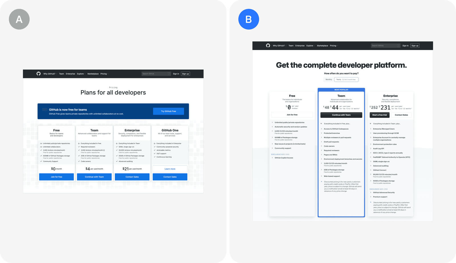
Github's redesign sharpened contrast between pricing tiers
| Attribute | Old page | Redesigned page |
|---|---|---|
| Tier contrast | Tiers look alike | Higher tiers stand out |
| Highlighted features | Few, evenly spread | More, in higher tiers |
| Feature focus | Generic list | What customers value most |
| Look | Muted, cluttered | Vibrant, cleaner |
| Tiers | Includes outdated tier | Outdated tier removed |
Github changed its pricing page in three ways to make the tiers easier to tell apart and more appealing.
- The visual contrast between tiers was increased.
- More features were highlighted in the higher tiers.
- This made them stand out against the lower tiers.
- The features customers valued most were emphasized.
- The aim was to align the page with user priorities.
- The page's look was refreshed.
- Vibrant colors were used.
- An outdated tier was removed, giving a cleaner design.
The result
Free and paid signups both rose over 20%
Free signups20%
Paid signups20%
The new page lifted both free and paid signups by more than 20%.
- Signups grew for both free and paid plans.
- The increase was reported as 20+%.
In the growth library
Github, Misc test. GitHub redesigned its pricing page by sharpening the contrast between tiers, highlighting the features customers value most, and cleaning up the look. The changes lifted free and paid signups by more than 20 percent.
Lessons that draw on this:
More from  abtest.design · The whole library, and ask it anything