 Caddie
The bottom line
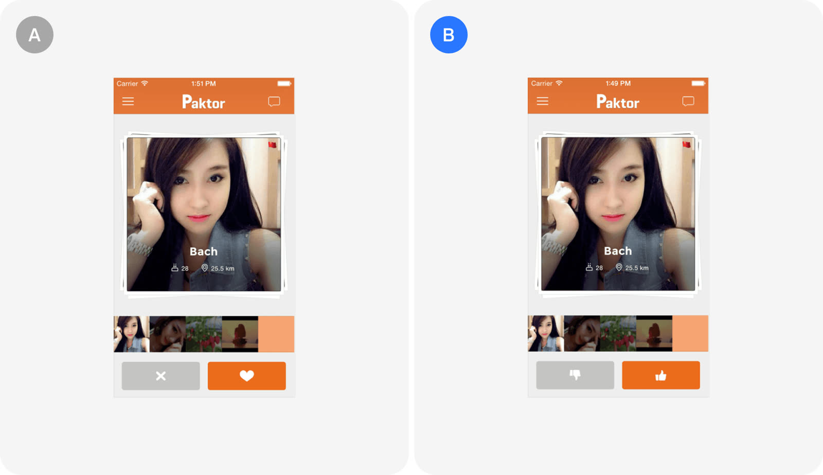
Paktor's thumbs up and thumbs down buttons beat the heart and X redesign on user engagement. A design that seemed more appealing did not lead to more interactions, so it had to be tested.
Key takeaways
- The thumbs up and thumbs down version won the test. It drove more engagement than the heart and X version the team expected to do better.
- The hypothesis was that a heart and an X would be more appealing and prompt more interactions.
- Both buttons got more clicks with thumbs. The gain showed up on the like and the dislike side.
- Clicks on the like button rose 6%.
- Clicks on the dislike button rose 4.3%.
- Thumbs also brought users back more often. The effect reached beyond single clicks to repeat use.
- Repeat app usage rose 2.3%.
The test
| Heart & X | Thumbs up/down | |
|---|---|---|
| Role | Proposed redesign | Existing design |
| Team expectation | More appealing, more taps | Baseline |
| Like / dislike clicks | Lower | +6% / +4.3% |
| Repeat usage | Lower | +2.3% |
| Outcome | Lost | Won |
Paktor, a mobile dating app in Asia, tested new like and dislike icons to raise engagement and retention.
- The team wanted to redesign the like and dislike buttons.
- The goal was to increase user engagement.
- The proposed design used a heart and an X.
- The test sits in the user engagement and retention category.
The result
The existing thumbs icons outperformed the heart and X design on every measure reported.
- Thumbs icons led to more clicks on both buttons.
- Like clicks were up 6%.
- Dislike clicks were up 4.3%.
- Thumbs icons also led to more repeat usage.
- Repeat app usage was up 2.3%.
In the growth library
Paktor, User engagement & retention test. Paktor tested a heart and X for its like and dislike buttons against thumbs up and thumbs down icons. The thumbs design won, lifting like clicks by 6%, dislike clicks by 4.3% and repeat app usage by 2.3%, so the expected winner was not the best performer.
Lessons that draw on this:
More from  abtest.design · The whole library, and ask it anything