 Caddie
The bottom line
A thin-bordered "See all free classes" button (Variant C) got the most clicks in Unacademy's three-way test, beating the original and a design matched to existing UI. Small changes to a CTA's look can noticeably change how many users discover trending classes.
Key takeaways
- The thin-bordered button won clearly. It drew the most clicks of the three designs.
- Variant C generated 13k clicks, against 9k for the original (A) and 7k for B.
- Matching the existing UI did not help. Variant B did worse than the original.
- B drew 7k clicks, 2k fewer than A.
- The test was a fair split of users. Users were divided equally among the three options.
The test setup
Three CTA designs tested for trending-class discovery
| A: Original | B: UI-matched | C: Thin border | |
|---|---|---|---|
| Button style | Existing CTA | Like other UI parts | Thin-bordered button |
| Idea behind it | Baseline | Blend in with the app | Light, distinct outline |
| Traffic share | 1/3 of users | 1/3 of users | 1/3 of users |
| Outcome | Baseline | Fewer clicks than A | Most clicks |
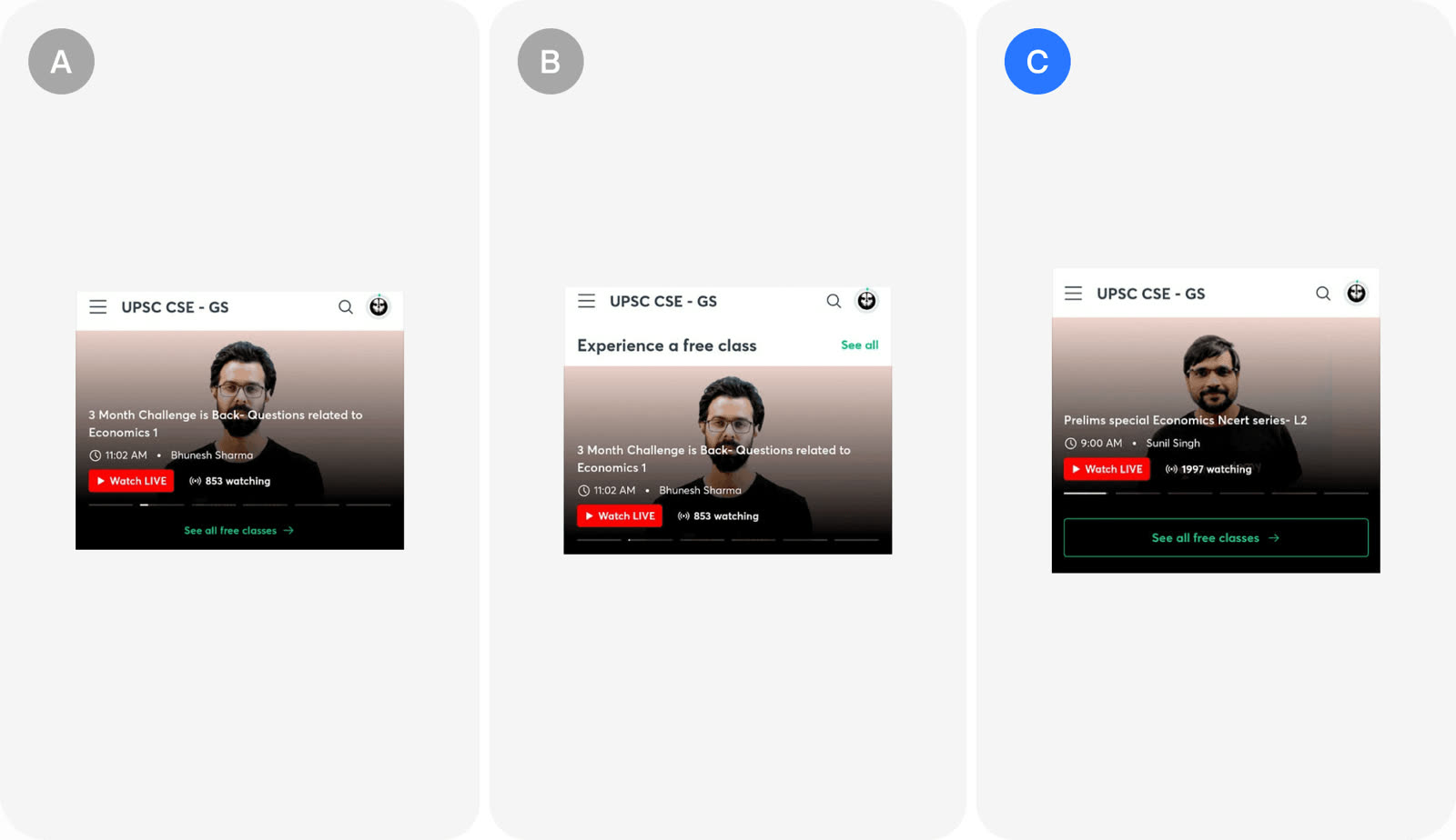
Unacademy tested two new CTA designs against the original to get more clicks on a button that surfaces trending classes.
- The goal was to make trending classes easier to discover.
- The test ran on the class carousel with a "See all free classes" button.
- Success was measured by user clicks on this CTA.
- Two variants were compared with the original.
- Variant B aligned the button with existing UI components.
- Variant C used a thin-bordered button.
The result
Thin-bordered button drew 13k clicks, far ahead
k clicks
C: thin border13
A: original9
B: matches UI7
Variant C won by a wide margin in total clicks.
- Variant C led on clicks.
- C: 13k clicks.
- A (original): 9k clicks.
- B: 7k clicks.
In the growth library
Unacademy, Misc test. A CTA design test on a class carousel showed that a thin-bordered button beat both the original and a button that matched the existing UI. The winning variant drove 13k clicks versus 9k and 7k for the others.
Lessons that draw on this:
More from  abtest.design · The whole library, and ask it anything