 Caddie
The bottom line
Chick-fil-A fixed a misleading payment screen in its app by testing new layouts and CTAs, so customers saw they could pay by credit card and not only with the loyalty card. Credit card payments rose 6% and complaints fell to zero.
Key takeaways
- The old payment screen made customers think only the loyalty card was accepted. That belief lowered cart conversions.
- The problem was in the app's UX, not in the payment options themselves.
- New layouts and CTAs made the payment options clear. Clearer options removed the confusion.
- The fix improved both sales and customer experience. Credit card use went up and complaints stopped.
- Credit card payments rose 6%.
- Customer complaints fell to 0.
The problem and the test
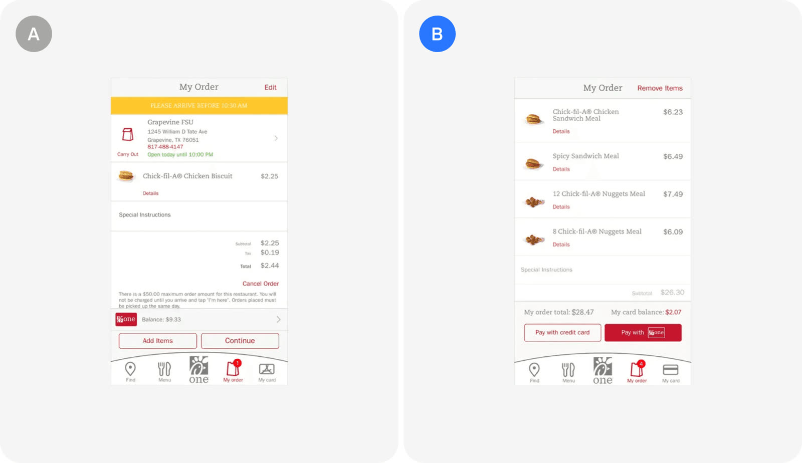
A misleading checkout UX hid the fact that credit cards were accepted, and Chick-fil-A tested new designs to fix it.
- Customers wrongly believed they could only pay with the loyalty card.
- This led to lower cart conversions.
- Chick-fil-A tested new layouts and CTAs to clarify the payment options.
- The test ran in the Chick-fil-A app, in the checkout and sales category.
The result
| Old screen | New screen | |
|---|---|---|
| Options shown | Loyalty card dominant | Card and loyalty, clear |
| Customer belief | Loyalty card only | Credit cards accepted |
| Credit card payments | Baseline | +6% |
| Complaints | Recurring | 0 |
The clearer design resolved the confusion and raised credit card payments.
- Credit card payments increased by 6%.
- Customer complaints about the issue dropped to 0.
- The confusion was eliminated and the overall user experience improved.
In the growth library
Chick-fil-A, Checkout & sales test. Clear payment options at checkout stop customers from wrongly believing they can only pay with a loyalty card. Chick-fil-A tested new layouts and CTAs and got a 6% increase in credit card payments and customer complaints about the issue dropped to 0.
Lessons that draw on this:
More from  abtest.design · The whole library, and ask it anything