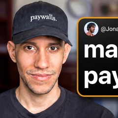
Jonathan Parra
Lead paywall designer at Superwall (designed 4,000+ paywalls), interviewed by Joseph Choi of Consumer Club
Where to hear and read about Jonathan Parra1 episode or test

Jonathan Parra is the lead paywall designer at Superwall and has built thousands of paywalls by hand for its customers. The thing most worth learning from him is that no paywall template wins everywhere, so start from a simple bullet-list baseline and let tests on your own app decide what stays.
There is no perfect paywall. You would expect the performance to be around the same, and it could just flounder completely in one app versus another.
I made 4,000 app paywalls and learned this
Jonathan Parra: the story and the lessons
1How Jonathan Parra came to design thousands of paywalls
Parra is Superwall's lead designer and has built about 4,500 paywalls. He builds customers' paywalls by hand inside Superwall. A September 2024 tweet claimed 2,000 paywalls in two years, and the count has since more than doubled.
He admits he should start tracking the number. Another summary of the same talk rounds it to 4,000+.
He joined Superwall before revenue and rebuilt paywalls across three tool generations. He started building paywalls in Webflow, then coded them, then moved to the current Superwall editor. Traffic grew so large that Superwall cost Webflow about 12% of its egress costs.
He says paywalls that worked three years ago look different from today's, since everyone copies each other. He now builds a system that mixes everything he has seen.
He went looking for a copy-and-paste golden paywall and found none. His goal was a set of paywalls anyone could copy. The belief in a copyable winner broke on real apps.
He calls this the most surprising finding for everyone who ran these tests.
He learned A/B testing from Jake and Nick Godwin at Superwall. They led Superwall's consumer growth calls. In his three years there, customers ran tests steadily and never ran out of ideas.
2How Parra approaches paywall testing
Parra expects no paywall to transfer unchanged between apps. The same paywall can do well in one app and flop in another app of the same category. His answer is a component system: parts that tend to work, dropped into each paywall and tested again.
Every result he cites is a single example with no sample sizes, so the lesson is to test on your own app, not to copy his numbers.
He starts most customers with a one-page bullet list. It has a heading with the USP, a few bullets, social proof and a large Continue button. It holds up across app categories, so later variants with a video, an image or more pages can be compared to it.
"Bullet list paywalls just actually are one of the few paywalls that perform well across the board." For newer apps he wants the one-screen version first.
Parra tests design and packaging before price points. Most paywall mistakes sit in how plans are packaged, usually in the footer. Price tests need users split into fixed cohorts, which is hard to manage, so they come later.
He sees strong paywalls keep working even after others copy them. The Blinkist free trial timeline (unlock today, a notification on day five, billing on day seven) has performed for years. He sees no half-life, even after people copy a design.
This fits products with a clear USP and a clear hero's journey, like the Clear 30 style. Products outside that pattern need more creative testing.
Testing pays most for apps that have never tested. Apps near $100K a month with little testing see the best gains, since the first test pays back immediately. Newer apps at $10K to $50K a month can lift conversion from about 8%, the average he sees, to 15 to 20%.
The lift needs no extra ad spend and no new product work.
3Parra's rules for simplifying a paywall
Parra assumes users don't read, so he cuts copy and choices. A paywall with a big app image and a plain Continue button beat a feature comparison table by 111%. The losing version packed in 3, 6 and 12 month plans, struck-through prices and a chart.
The winner said to try the app for 50% off, with details on the next screen. The idea came from Cali, and Parra isn't sure why it works. It is one test.
He swaps descriptive button copy for a plain Continue. A cluttered control listed weekly, annual and monthly with "Put AI into action". The variant led with annual, added a no-commitment line and said Continue, and won by about 10%.
He says the cleaner product group drove most of the gain. His buttons are large, about 65 points tall and sometimes 56. If a trial is selected, he uses "Start my 3-day trial".
He adds "No commitment, cancel anytime" to almost every paywall. The line sits under the button and adds a small, granular bump. It costs nothing to add.
The bump is described but never measured on its own.
He hides extra plans to cut decision fatigue. One paywall dropped monthly, kept annual and weekly, and read "Start my 3-day trial". Conversion rose sharply over a three-plan layout with no trial.
Annual stayed preselected because its LTV and ARPU were highest for that customer. Plans run in order of length, never weekly, annual, monthly, and the rest can sit behind a "view all plans" button.
Any table he tried lost to bullets, a video or a visual cue. A short video of the app in use gives a clear value prop. A video paywall with social proof and bullets won its test, built from a phone recording in Rotato.
The design was inspired by Mojo. It compared monthly and yearly plans, with copy aimed at a largely female audience.
A plain native look beat custom designs for one app. For Pyometer Plus+, a paywall in the standard Swift UI style beat every more custom variant "by quite a long shot". A second app also did fairly well with it.
He suspects it matched what users already saw in the app. He keeps some brand flair, like Snapchat, which avoids the default blue.
4How Parra thinks about plans, pricing and offers
Parra tests weekly plans because users often pay more that way. Weekly spread with AI wrapper apps: users who won't commit to a year get in, and many forget to cancel. About half of trial users cancel after subscribing, but the app still gets to show its product.
Social and multiplayer apps now favor weekly and monthly, so he would test annual plus weekly against annual plus monthly.
He reads a high monthly share as a sign of weak onboarding. Weekly and monthly buyers are usually unsure the product will work for them. Many monthly customers suggest onboarding didn't show the product well.
He defaults to annual because it usually has the highest LTV.
He answers each paywall close with a softer offer, then a small discount. Closing opens a drawer saying the user isn't ready to commit for a year, with yearly kept selected. It shows $39 a year as 76 cents a week. A second close triggers a one-time offer, such as yearly dropping from $40 to $30.
He keeps discounts between 25% and 33% to save big sales for Black Friday and Cyber Monday. Too many sales cheapen the brand, especially for larger apps.
He uses a free trial test to diagnose the product. If onboarding is good but churn after a trial is high, the problem is the product. A trial suits apps without heavy inference costs.
He says niche AI apps with tuned prompts can charge more. AI rapper apps settled near $30 to $40 a year when inference is mostly text. One chat app charges about $20 to $22 a month because its prompt fits a niche.
Insecurity-driven niches charge the most, such as appearance apps and dating apps that suggest replies. Image and video apps charge more because of compute costs.
Parra uses a friends and family plan and a darker Pro look to lift revenue. Many users skip the one-person annual plan for a shared one, but it needs more work and more Apple SDKs. On a Plus and Pro app, a dark Pro background after a white Plus one pushed more users to Pro.
The Pro look was inspired by Hinge.
I made 4,000 app paywalls and learned this
Paywall design and packaging are the biggest levers in paywall A/B testing, and simpler paywalls with a generic Continue button, a no-commitment line and clean plan groups usually win. After 4,000+ paywalls, the main lesson is that no paywall is universal, so start from a bullet-list baseline and test components.
Parra is Superwall's lead designer and has built about 4,500 paywalls. He builds customers' paywalls by hand inside Superwall. A September 2024 tweet claimed 2,000 paywalls in two years, and the count has since more than doubled.
He admits he should start tracking the number. Another summary of the same talk rounds it to 4,000+.
He joined Superwall before revenue and rebuilt paywalls across three tool generations. He started building paywalls in Webflow, then coded them, then moved to the current Superwall editor. Traffic grew so large that Superwall cost Webflow about 12% of its egress costs.
He says paywalls that worked three years ago look different from today's, since everyone copies each other. He now builds a system that mixes everything he has seen.
He went looking for a copy-and-paste golden paywall and found none. His goal was a set of paywalls anyone could copy. The belief in a copyable winner broke on real apps.
He calls this the most surprising finding for everyone who ran these tests.
He learned A/B testing from Jake and Nick Godwin at Superwall. They led Superwall's consumer growth calls. In his three years there, customers ran tests steadily and never ran out of ideas.
Parra expects no paywall to transfer unchanged between apps. The same paywall can do well in one app and flop in another app of the same category. His answer is a component system: parts that tend to work, dropped into each paywall and tested again.
Every result he cites is a single example with no sample sizes, so the lesson is to test on your own app, not to copy his numbers.
He starts most customers with a one-page bullet list. It has a heading with the USP, a few bullets, social proof and a large Continue button. It holds up across app categories, so later variants with a video, an image or more pages can be compared to it.
"Bullet list paywalls just actually are one of the few paywalls that perform well across the board." For newer apps he wants the one-screen version first.
Parra tests design and packaging before price points. Most paywall mistakes sit in how plans are packaged, usually in the footer. Price tests need users split into fixed cohorts, which is hard to manage, so they come later.
He sees strong paywalls keep working even after others copy them. The Blinkist free trial timeline (unlock today, a notification on day five, billing on day seven) has performed for years. He sees no half-life, even after people copy a design.
This fits products with a clear USP and a clear hero's journey, like the Clear 30 style. Products outside that pattern need more creative testing.
Testing pays most for apps that have never tested. Apps near $100K a month with little testing see the best gains, since the first test pays back immediately. Newer apps at $10K to $50K a month can lift conversion from about 8%, the average he sees, to 15 to 20%.
The lift needs no extra ad spend and no new product work.
Parra assumes users don't read, so he cuts copy and choices. A paywall with a big app image and a plain Continue button beat a feature comparison table by 111%. The losing version packed in 3, 6 and 12 month plans, struck-through prices and a chart.
The winner said to try the app for 50% off, with details on the next screen. The idea came from Cali, and Parra isn't sure why it works. It is one test.
He swaps descriptive button copy for a plain Continue. A cluttered control listed weekly, annual and monthly with "Put AI into action". The variant led with annual, added a no-commitment line and said Continue, and won by about 10%.
He says the cleaner product group drove most of the gain. His buttons are large, about 65 points tall and sometimes 56. If a trial is selected, he uses "Start my 3-day trial".
He adds "No commitment, cancel anytime" to almost every paywall. The line sits under the button and adds a small, granular bump. It costs nothing to add.
The bump is described but never measured on its own.
He hides extra plans to cut decision fatigue. One paywall dropped monthly, kept annual and weekly, and read "Start my 3-day trial". Conversion rose sharply over a three-plan layout with no trial.
Annual stayed preselected because its LTV and ARPU were highest for that customer. Plans run in order of length, never weekly, annual, monthly, and the rest can sit behind a "view all plans" button.
Any table he tried lost to bullets, a video or a visual cue. A short video of the app in use gives a clear value prop. A video paywall with social proof and bullets won its test, built from a phone recording in Rotato.
The design was inspired by Mojo. It compared monthly and yearly plans, with copy aimed at a largely female audience.
A plain native look beat custom designs for one app. For Pyometer Plus+, a paywall in the standard Swift UI style beat every more custom variant "by quite a long shot". A second app also did fairly well with it.
He suspects it matched what users already saw in the app. He keeps some brand flair, like Snapchat, which avoids the default blue.
Parra tests weekly plans because users often pay more that way. Weekly spread with AI wrapper apps: users who won't commit to a year get in, and many forget to cancel. About half of trial users cancel after subscribing, but the app still gets to show its product.
Social and multiplayer apps now favor weekly and monthly, so he would test annual plus weekly against annual plus monthly.
He reads a high monthly share as a sign of weak onboarding. Weekly and monthly buyers are usually unsure the product will work for them. Many monthly customers suggest onboarding didn't show the product well.
He defaults to annual because it usually has the highest LTV.
He answers each paywall close with a softer offer, then a small discount. Closing opens a drawer saying the user isn't ready to commit for a year, with yearly kept selected. It shows $39 a year as 76 cents a week. A second close triggers a one-time offer, such as yearly dropping from $40 to $30.
He keeps discounts between 25% and 33% to save big sales for Black Friday and Cyber Monday. Too many sales cheapen the brand, especially for larger apps.
He uses a free trial test to diagnose the product. If onboarding is good but churn after a trial is high, the problem is the product. A trial suits apps without heavy inference costs.
He says niche AI apps with tuned prompts can charge more. AI rapper apps settled near $30 to $40 a year when inference is mostly text. One chat app charges about $20 to $22 a month because its prompt fits a niche.
Insecurity-driven niches charge the most, such as appearance apps and dating apps that suggest replies. Image and video apps charge more because of compute costs.
Parra uses a friends and family plan and a darker Pro look to lift revenue. Many users skip the one-person annual plan for a shared one, but it needs more work and more Apple SDKs. On a Plus and Pro app, a dark Pro background after a white Plus one pushed more users to Pro.
The Pro look was inspired by Hinge.