
Welltory
A health app that turns Apple Watch signals into a story of daily stress and energy.
Welltory reached about $18M ARR and close to 18M downloads over 10 years. Its onboarding asks for health data sync first (over 90% agree, though untested thoroughly), shows users their own stress data, and ends on fear of loss before a mostly annual $99.99 no-trial paywall. Fear beat benefit framing, and over 60% of conversions come months later. Lesson: use personal data as proof and keep re-exposing the paywall.
- 1Sync Apple Watch dataFirst screen; over 90% agree
- 2Show own stress minutese.g. 192 minutes of sedentary stress
- 3Show recovery timelineBlue period where body fought back
- 4Show 30-day stress calendarOnly about 20 to 30% recovered
- 5Paywall: stress building nowNo trial, annual plan $99.99
From Asia Paloni, Welltory CPO, podcast interview
What was said about Welltory
1The six-part pitch behind Welltory's onboarding
Build onboarding as one pitch in six ingredients, in a fixed order. Welltory's onboarding runs human problem, promise, key, mechanism, proof, and a closing fear of missing out. The team failed miserably at onboarding over and over before landing on this structure.
The promise stays curious, not complete: "Hook up your data and we'll show you what's going on." The key is "sedentary stress," which drains energy while you think you're resting, and the mechanism is the app showing in real time when bad stress happens and when you relieve it. Chief Product Officer Asia Paloni says the formula can pitch almost anything, not only onboarding.
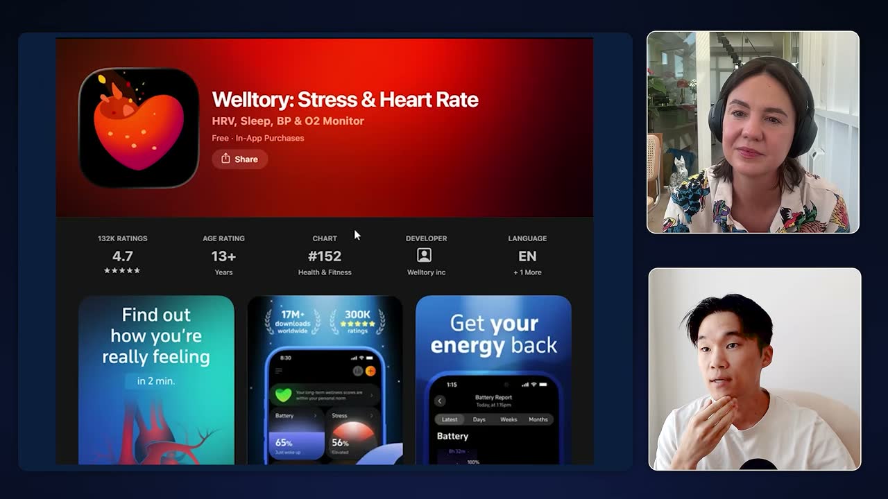
Welltory's App Store page: 4.7 rating from 132K reviews, #152 in Health & Fitness, benefit-led screenshots. Spend months learning the user's specific, felt problem before writing anything. Paloni pictures a user who was high energy when younger and now ends the day doom scrolling TikTok on the couch instead of cooking, seeing their kids or doing creative work. She built that picture partly from the podcast The Dream, whose host is exhausted and feels her life slipping away.
The work is finding when in the day the user feels it most. She calls skimping here the biggest pitch mistake and says no one, AI included, can do it for you: "You have to kind of like sit with it, I think, for many months."
The story arc matters more than polished copy on each screen. A former copywriter, Paloni used to fixate on perfect words, but the onboarding only worked once the full arc was in the right order.
Animated visuals of stress inside the arteries carry emotion where the product is invisible; she credits the design team for this. "This formula matters a lot more than the actual words I'm using."
2Health data sync first, and the user's own data as proof
Welltory's first screen asks for the health data sync, with no intro slides. The first button asks users to sync Apple Watch health data under a curiosity hook like "Your Apple Watch knows what makes you tired and stressed," and over 90% agree.
Every "little prelude" Paloni tried did worse than going straight to the button. The 90% figure is her own account, and she admits the first-screen call to action has not been tested thoroughly.
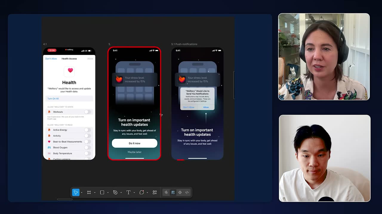
Welltory's onboarding screens: Apple Health access, then an early push-notification request ('Turn on important health updates'). Showing users their own stress data is the strongest proof. After syncing, the app shows the user's own day, such as "192 minutes" of sedentary stress, which makes the pitch personal before any payment. Reviews, millions of users, journal publications and university research partnerships sit around it as secondary proof.
While the analysis runs, a teaser shows how much data is being processed. The day shown is whichever has the cleanest sample, so it may be yesterday or the day before. "The most powerful proof that we use actually is that we are showing you your own data."
Permission screens come early, notifications included, against best practice. Health data requires several agreement screens, and the app states it never sells or shares data. Welltory asks for notifications right away, which Paloni says worked best for them even though "you're not supposed to do this."
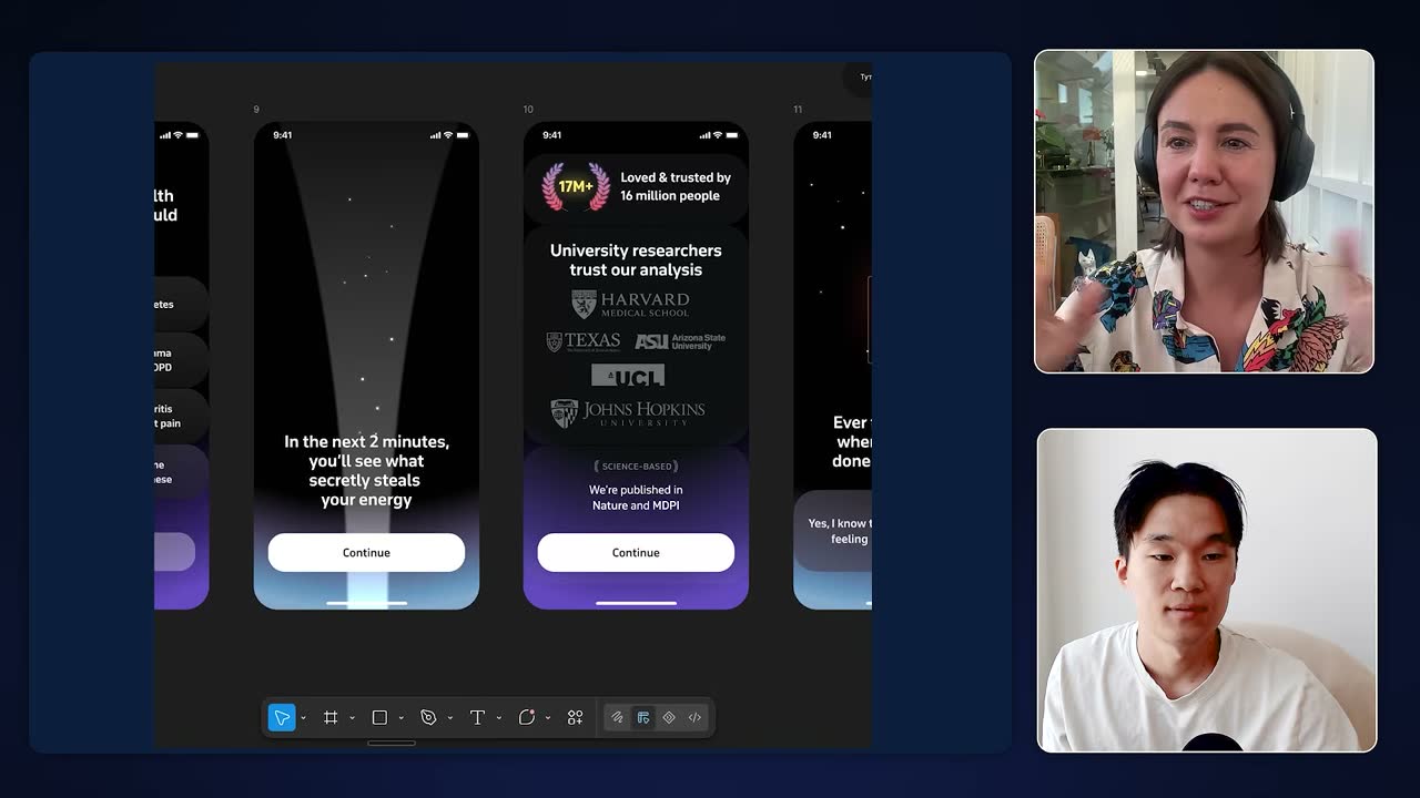
Onboarding trust screen citing 17M+ users and Harvard, Texas, ASU, UCL, Johns Hopkins researchers. Offer answer options in both stress and low-energy wording. A segmentation question has six options because women and men describe the problem differently: over half of women, closer to 70% by Paloni's guess, say they are low on energy or drained, while men say they are sometimes stressed or doing fine even when their data looks worse.
A trust screen with the university partnerships sits just before what she calls the "woo woo science."
Re-evoke the pain, then show recovery so bad news isn't hopeless. After the permission screens, "Ever feel tired even when you haven't done much all day?" slows things down to bring users back to why they came. Right after the 192 stress minutes, a day timeline shows a blue recovery period where the body fought back.
Next comes a 30-day calendar with animated red bars of built-up stress, showing only about 20 to 30% recovered unaided, then reviews, then the paywall. The question is not mainly meant to win a yes.
3Closing with fear of loss: the paywall and late conversions
- Energy bank filling up
- Weekly and monthly progress charts
- Headline: stress is building right now
- You'll be just as tired tonight
Fear close worked better, per Paloni; untested
From Asia Paloni, Welltory CPO, podcast interview
Close on what users lose tonight, not on benefits. The close says that without paying you won't see when bad stress hits and you'll be just as tired tonight. An ending built on benefits, such as an "energy bank filling up" and weekly and monthly progress charts, worked worse.
The paywall headline reads "stress is building right now," with "see what's driving it and how to interrupt it" only as the subheadline. Paloni says this last step is where she kept "failing spectacularly." The comparison comes from her account with no test data, and the effect of scare framing on churn, refunds or trust is not examined.
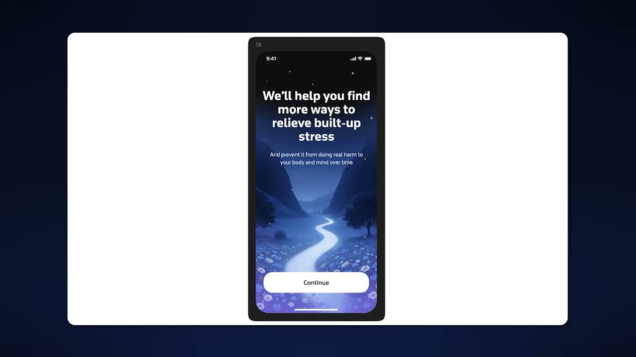
Onboarding screen 19 shifts to hope: "We'll help you find more ways to relieve built-up stress." Use fear framing when your product has no daily trigger. Apps like Uber or Spotify have a natural trigger, so selling benefits is easy. Health, fitness and probably language apps don't, so urgency has to be created inside the onboarding by putting users back into the felt pain.
Paloni sees benefit stories as better suited to brand storytelling than to the moment of purchase.
Keep vital tracking free and sell analysis behind a no-trial annual paywall. Energy battery, stress built up, sleep score, activity, blood pressure and life-saving signals are free. Paid unlocks the day timeline, trend analysis and activity recommendations, behind a closable paywall with no trial that mostly sells the annual plan at $99.99.
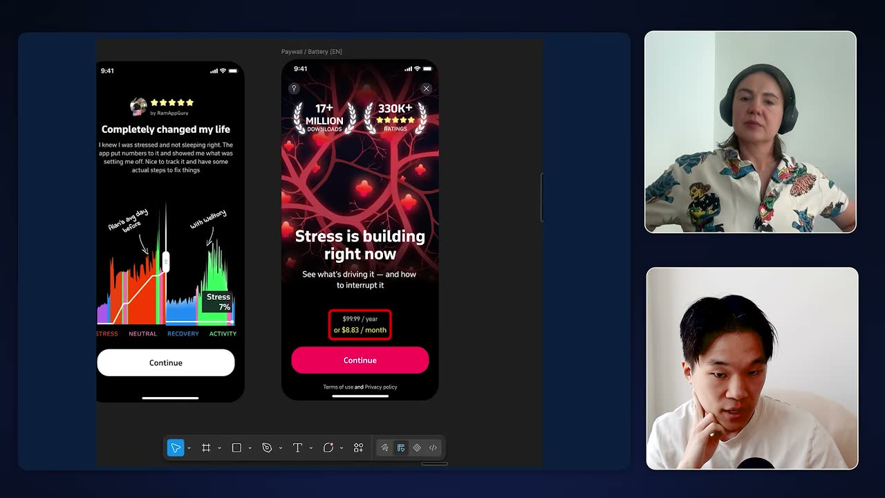
Welltory's paywall screen offers a single annual plan: $99.99/year, framed as $8.83/month. Most conversions come after day one, so keep re-exposing the paywall. After a burst on day one, over 60% of conversions happen over the following couple of months as users see daily stats and build the habit.
Paloni calls this unusual for health and fitness apps. The company reports about $18M ARR and close to 18 million downloads after 10 years.
4Meta ads and the link between marketing and product
Ads promise to make something scary inside the body visible. Long-term promises like "you'll have more energy" work poorly on Meta, where people scroll fast. Each Welltory ad clings to a feared process, such as cortisol or what happens in the arteries.
One ad shows large colorful Apple Watch charts while a voiceover lists symptoms like bad sleep and sugar cravings, then names cortisol as the cause. The ad doesn't need to show the real feature or carry the science, only a premise people already fear.
Product should borrow the ads' overall promise, not their specific features. Marketing and product lived in silos, and closing the rift took about a year and a half to two years. Product now takes the promise ads convey, making invisible body processes visible, rather than building what a single ad depicts.
"It would be a mistake to go and make those specific features."
5Interpreting data Apple Health only displays
Give AI less data and more meaning by turning signals into a story. Dumping all health data into a chatbot confuses it and yields standard, almost bad advice. Welltory turns the day's signals into a story of when drain and recovery happened, layers on users' subjective notes, and lets AI suggest what triggered each shift.
Apple Health shows a heart rate variability number without interpreting it; higher is not always better, and overnight readings say more about rest than daytime ones. Long-term data yields stories of how a person's health changed and why.
How to Build an $18M/Year Apple Watch App (FREE MASTERCLASS)
About 18M ARR and close to 18M downloads after 10 years. Onboarding asks for health data sync first (over 90% agree), shows the user's own stress minutes, and closes with fear of loss on a mostly annual $99.99 paywall with no trial. Over 60% of conversions happen in the months after day one.
Build onboarding as one pitch in six ingredients, in a fixed order. Welltory's onboarding runs human problem, promise, key, mechanism, proof, and a closing fear of missing out. The team failed miserably at onboarding over and over before landing on this structure.
The promise stays curious, not complete: "Hook up your data and we'll show you what's going on." The key is "sedentary stress," which drains energy while you think you're resting, and the mechanism is the app showing in real time when bad stress happens and when you relieve it. Chief Product Officer Asia Paloni says the formula can pitch almost anything, not only onboarding.
Welltory's App Store page: 4.7 rating from 132K reviews, #152 in Health & Fitness, benefit-led screenshots. Spend months learning the user's specific, felt problem before writing anything. Paloni pictures a user who was high energy when younger and now ends the day doom scrolling TikTok on the couch instead of cooking, seeing their kids or doing creative work. She built that picture partly from the podcast The Dream, whose host is exhausted and feels her life slipping away.
The work is finding when in the day the user feels it most. She calls skimping here the biggest pitch mistake and says no one, AI included, can do it for you: "You have to kind of like sit with it, I think, for many months."
The story arc matters more than polished copy on each screen. A former copywriter, Paloni used to fixate on perfect words, but the onboarding only worked once the full arc was in the right order.
Animated visuals of stress inside the arteries carry emotion where the product is invisible; she credits the design team for this. "This formula matters a lot more than the actual words I'm using."
Welltory's first screen asks for the health data sync, with no intro slides. The first button asks users to sync Apple Watch health data under a curiosity hook like "Your Apple Watch knows what makes you tired and stressed," and over 90% agree.
Every "little prelude" Paloni tried did worse than going straight to the button. The 90% figure is her own account, and she admits the first-screen call to action has not been tested thoroughly.
Welltory's onboarding screens: Apple Health access, then an early push-notification request ('Turn on important health updates'). Showing users their own stress data is the strongest proof. After syncing, the app shows the user's own day, such as "192 minutes" of sedentary stress, which makes the pitch personal before any payment. Reviews, millions of users, journal publications and university research partnerships sit around it as secondary proof.
While the analysis runs, a teaser shows how much data is being processed. The day shown is whichever has the cleanest sample, so it may be yesterday or the day before. "The most powerful proof that we use actually is that we are showing you your own data."
Permission screens come early, notifications included, against best practice. Health data requires several agreement screens, and the app states it never sells or shares data. Welltory asks for notifications right away, which Paloni says worked best for them even though "you're not supposed to do this."
Onboarding trust screen citing 17M+ users and Harvard, Texas, ASU, UCL, Johns Hopkins researchers. Offer answer options in both stress and low-energy wording. A segmentation question has six options because women and men describe the problem differently: over half of women, closer to 70% by Paloni's guess, say they are low on energy or drained, while men say they are sometimes stressed or doing fine even when their data looks worse.
A trust screen with the university partnerships sits just before what she calls the "woo woo science."
Re-evoke the pain, then show recovery so bad news isn't hopeless. After the permission screens, "Ever feel tired even when you haven't done much all day?" slows things down to bring users back to why they came. Right after the 192 stress minutes, a day timeline shows a blue recovery period where the body fought back.
Next comes a 30-day calendar with animated red bars of built-up stress, showing only about 20 to 30% recovered unaided, then reviews, then the paywall. The question is not mainly meant to win a yes.
Close on what users lose tonight, not on benefits. The close says that without paying you won't see when bad stress hits and you'll be just as tired tonight. An ending built on benefits, such as an "energy bank filling up" and weekly and monthly progress charts, worked worse.
The paywall headline reads "stress is building right now," with "see what's driving it and how to interrupt it" only as the subheadline. Paloni says this last step is where she kept "failing spectacularly." The comparison comes from her account with no test data, and the effect of scare framing on churn, refunds or trust is not examined.
Onboarding screen 19 shifts to hope: "We'll help you find more ways to relieve built-up stress." Use fear framing when your product has no daily trigger. Apps like Uber or Spotify have a natural trigger, so selling benefits is easy. Health, fitness and probably language apps don't, so urgency has to be created inside the onboarding by putting users back into the felt pain.
Paloni sees benefit stories as better suited to brand storytelling than to the moment of purchase.
Keep vital tracking free and sell analysis behind a no-trial annual paywall. Energy battery, stress built up, sleep score, activity, blood pressure and life-saving signals are free. Paid unlocks the day timeline, trend analysis and activity recommendations, behind a closable paywall with no trial that mostly sells the annual plan at $99.99.
Welltory's paywall screen offers a single annual plan: $99.99/year, framed as $8.83/month. Most conversions come after day one, so keep re-exposing the paywall. After a burst on day one, over 60% of conversions happen over the following couple of months as users see daily stats and build the habit.
Paloni calls this unusual for health and fitness apps. The company reports about $18M ARR and close to 18 million downloads after 10 years.
Ads promise to make something scary inside the body visible. Long-term promises like "you'll have more energy" work poorly on Meta, where people scroll fast. Each Welltory ad clings to a feared process, such as cortisol or what happens in the arteries.
One ad shows large colorful Apple Watch charts while a voiceover lists symptoms like bad sleep and sugar cravings, then names cortisol as the cause. The ad doesn't need to show the real feature or carry the science, only a premise people already fear.
Product should borrow the ads' overall promise, not their specific features. Marketing and product lived in silos, and closing the rift took about a year and a half to two years. Product now takes the promise ads convey, making invisible body processes visible, rather than building what a single ad depicts.
"It would be a mistake to go and make those specific features."
Give AI less data and more meaning by turning signals into a story. Dumping all health data into a chatbot confuses it and yields standard, almost bad advice. Welltory turns the day's signals into a story of when drain and recovery happened, layers on users' subjective notes, and lets AI suggest what triggered each shift.
Apple Health shows a heart rate variability number without interpreting it; higher is not always better, and overnight readings say more about rest than daytime ones. Long-term data yields stories of how a person's health changed and why.
More in Health & Fitness
 Health & Fitness
Calm
A meditation and sleep app with guided sessions and celebrity-narrated Sleep Stories.


 45 sources · 102 tips
 Health & Fitness
Cal AI
A calorie tracking app that logs meals from photos, grown largely through influencer and UGC videos.
28 sources · 104 tips Health & Fitness
Headspace
A meditation and mental wellness app with guided sessions and subscriptions.
 27 sources · 50 tips
 Health & Fitness
Flo
A data tool that combines app analytics into one view and is adding AI agents.
 10 sources · 31 tips
 Health & Fitness
Ladder
A strength training app with human coaches, a workout journal and a nutrition feature.
12 sources · 39 tips Health & Fitness
Zero
An intermittent fasting tracker app that teaches fasting and builds habits toward metabolic health.
6 sources · 21 tips Health & Fitness
Rise
A sleep and energy app that helps people track and pay down their sleep debt.
3 sources · 29 tips Health & Fitness
Runna
A personalized running coach app that builds adaptive training plans around a runner's race goals.
6 sources · 28 tips