
Houzz
A home remodeling and design app and marketplace connecting homeowners with products and professionals.
Houzz won two A/B tests by cutting friction and distraction. Splitting its onboarding contact form into three single-field screens raised conversion by more than 15%, despite needing more clicks. A stripped-down paid landing page focused only on 3D floor plans lifted free trial starts by 5%. Lesson: reduce effort per step, not click count, and match paid pages to one clear intent.
- Name, email, phone on one screen
- Fewer clicks
- Name, then email, then phone
- More clicks, lighter each screen
Conversion rose by more than 15%
From Houzz A/B test, onboarding
What was said about Houzz
1Houzz's A/B tests on onboarding and paid traffic
Houzz split one contact form into three single-field screens and conversion rose. Houzz replaced a single contact form in app onboarding with three screens: name, then email, then phone number. The multi-screen version lifted conversion by more than 15%, even though it needed more clicks.
It was tested against the earlier single-form design. Houzz's stated reasoning was to "reduce cognitive load by breaking down the information entry process, despite the increase in clicks required to complete the form." The takeaway is to judge onboarding by how hard each screen feels, not by total click count, and to test the extra-step version rather than assuming fewer screens wins.
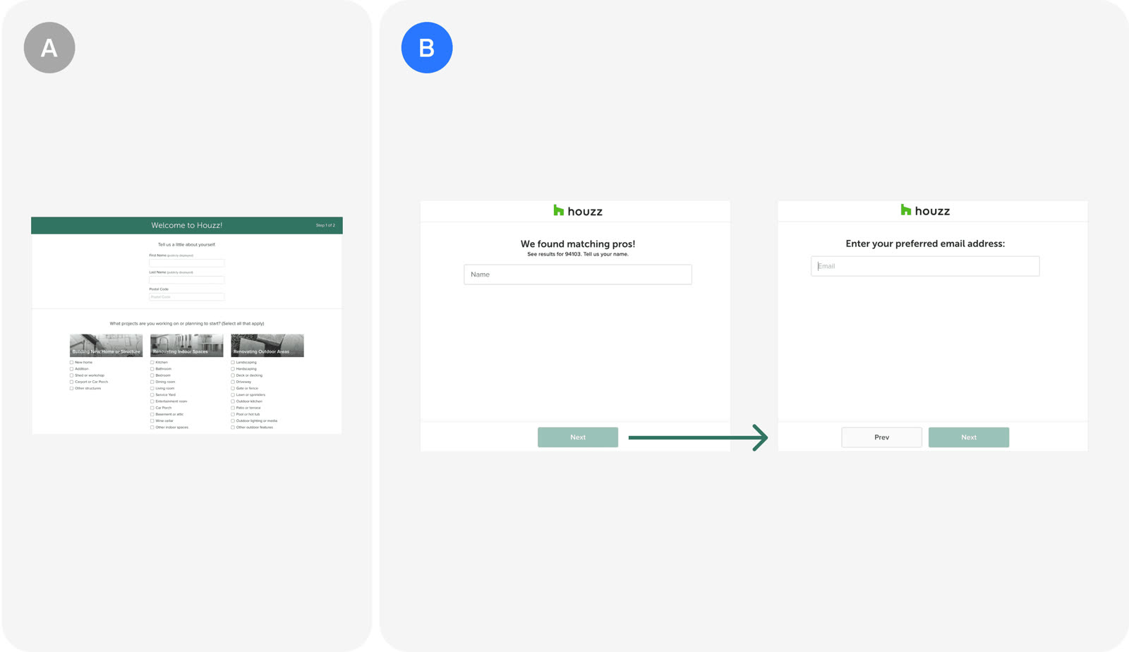
Version A and version B as Houzz tested them. Houzz built a stripped-down paid landing page around 3D floor plans. Paid traffic converted worse than other traffic, so Houzz made a landing page focused only on 3D floor plans, with no headers or additional information. Free trial starts rose 5%.
The page was meant to match the narrow intent of users who clicked an ad about that feature, rather than sending them to a general page that suits browsing organic visitors. Houzz described the change as "removing all distractions like headers and additional information" to "better align with the intent of paid users and improve conversions." The sources report one combined variant, so the effect of the single-feature focus cannot be separated from the removal of headers and extra content.
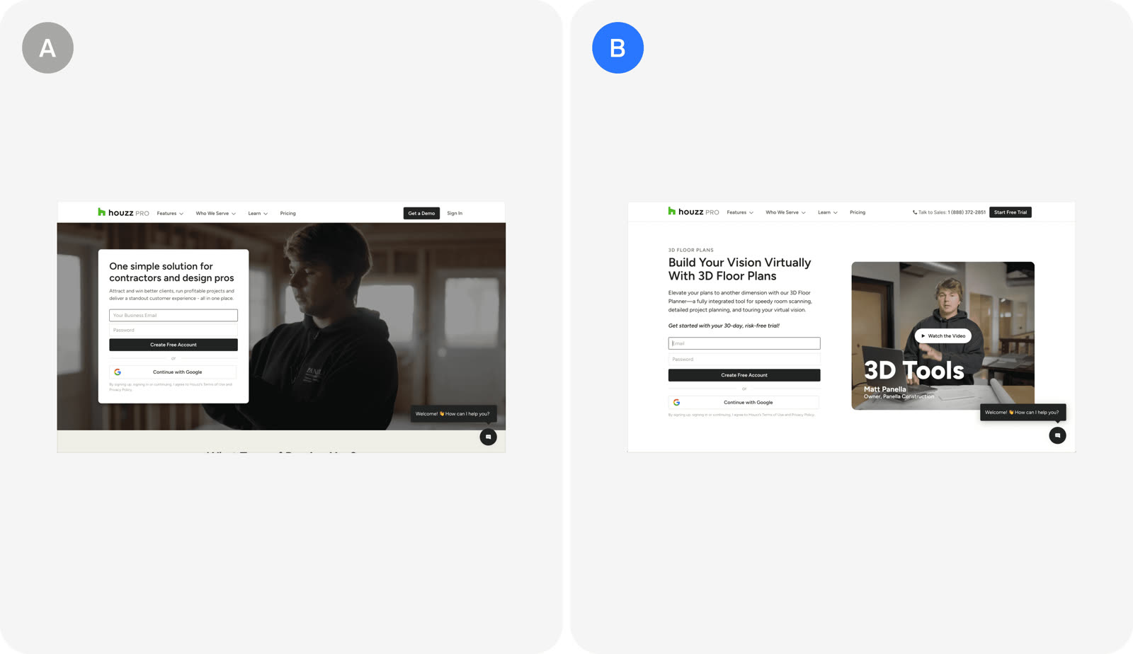
Version A and version B as Houzz tested them.

Separating contact information into multiple screens: Houzz's A/B test
Houzz replaced a single contact form in app onboarding with three single-field screens for name, email and phone number. Conversion rose by more than 15% even though the flow needed more clicks.
Houzz split one contact form into three single-field screens and conversion rose. Houzz replaced a single contact form in app onboarding with three screens: name, then email, then phone number. The multi-screen version lifted conversion by more than 15%, even though it needed more clicks.
It was tested against the earlier single-form design. Houzz's stated reasoning was to "reduce cognitive load by breaking down the information entry process, despite the increase in clicks required to complete the form." The takeaway is to judge onboarding by how hard each screen feels, not by total click count, and to test the extra-step version rather than assuming fewer screens wins.
Version A and version B as Houzz tested them.
Customized landing page for paid traffic: Houzz's A/B test
Paid traffic converted worse than other traffic, so Houzz built a stripped-down landing page focused only on 3D floor plans, with no headers or extra information. The variant lifted free trial starts by 5%.
Houzz built a stripped-down paid landing page around 3D floor plans. Paid traffic converted worse than other traffic, so Houzz made a landing page focused only on 3D floor plans, with no headers or additional information. Free trial starts rose 5%.
The page was meant to match the narrow intent of users who clicked an ad about that feature, rather than sending them to a general page that suits browsing organic visitors. Houzz described the change as "removing all distractions like headers and additional information" to "better align with the intent of paid users and improve conversions." The sources report one combined variant, so the effect of the single-feature focus cannot be separated from the removal of headers and extra content.
Version A and version B as Houzz tested them.
More in Lifestyle
 Lifestyle
Drunk Mode
A nightlife app that helps students find parties while staying safe with friends.
 2 sources · 26 tips
 Lifestyle
Gojek
An Indonesian super app for ride hailing, food delivery, payments and many other on-demand services.
 2 sources · 23 tips
 Lifestyle
Thumbtack
A marketplace connecting homeowners with local service professionals for home projects.
7 sources · 10 tips Lifestyle
Hermes
A French luxury house making handcrafted leather goods, silk scarves and clothing, run by the Dumas family.
 2 sources · 18 tips
 Lifestyle
Life360
A family safety app that locates and protects people, pets and things through shared circles.
 2 sources · 19 tips
 Lifestyle
Purpose
An AI mentor app for personal growth, co-founded by Mark Manson, that pushes back on users.

 2 sources · 17 tips
Caveman
A paid app giving men one romantic tip for every day of the year.
1 source · 9 tips Lifestyle
Flame
An AI relationship app for couples built around a daily question, widgets and reply tools.
1 source · 18 tips